
Plandemonium
PROJECT OVERVIEW
Plandemonium, a web application that makes group travel planning a little less “hellish” by allowing groups to personalize and game-ify the experience.
ROLE
User Research
UX Design
Visual Design
CONSTRAINTS
Mobile first design
DATE
December 2024
BACKGROUND
While perusing the internet I found that most travel sites and apps catering to large groups primarily focus on appealing to young adults planning bachelorette parties or adrenaline fueled adventures.
But I also found that as people continue to make up for the “togetherness” lost during the COVID pandemic, more and more families were looking for ways to travel together.
DISCOVER
Research
Objectives
Travel panning is a broad topic with many factors and parties to consider, so it was imperative my research helped me understand:
How multi-family or group trips differ from single family trips
Why people would choose to use a travel agent or not to plan a multi-family or group vacation
How people currently plan multi-family or group trips and why
Where people get inspiration for multi-family or group trip destinations
How often people take multi-family or group trips compared to single family trips and why
What roles naturally form during the multi-family or group trip planning process and why
Learn what tools already exist and how we can differentiate ourselves in the market
From my own experience I know that indecision, breakdowns in communication, and lack of consensus among other things can make planning a group trip particularly frustrating, especially for the appointed planner. But since we don’t design for ourselves, more research was needed.
Competitive Analysis
From analyzing both direct and indirect competitors, I saw several key opportunities to bring into my design:
Features with polls or voting to promote group collaboration
Trip inspiration or guidance for less experienced travelers
Mirroring or integration with other apps, sites, or services that travelers are already using and have affinity for
User Interviews
To better understand the real experiences people have had with group travel planning, I recruited 6 participants for user interviews.
I focused on asking open-ended questions about their experiences with travel planning, general travel, multi-family travel, and other group planning participation to learn as much as possible about my users and their goals. Here are a few key findings and notable quotes from particpants:
People are willing to compromise
Traveling with a large group is very different from traveling solo or with your significant other, but people are willing to make some sacrifices to spend time with loved ones
Quality over quantity
Instead of a jam-packed itinerary, it’s more important to have flexibility to allow for quality time with family and friends
Trip planning isn’t for everyone
Whether someone enjoys travel planning or not is very much based on personality, but every group seems to have someone to default to that is a “planner”
In-person planning is preferred
Having an in-person trip planning session or meeting (even informally) seems to be a timeless, universal part of any trip
Notable Quotes
Affinity Mapping
To help me synthesize all of the information I had gathered from the user interviews, I created an affinity map to identify common patterns and key insights.
There’s No One “Right” Way to Plan
The "planners" of the group enjoy the process of puzzling out the logistical details and they don't necessarily need help doing it (as we've seen from how they plan trips for just themselves and their SOs or immediate families)
Planners are self-described “control freaks,” so it is not likely they would adopt a new tool to replace their whole planning process, especially when planning smaller group trips doesn't seem to be an issue
Someone Ultimately Has to Take Charge
Having a clear leader with permission and everything they need to effectively plan from the very beginning makes the planning process and the trip itself less stressful for everyone involved
People either don't know their personal travel preferences until they experience something going wrong or they haven't traveled enough, so it's hard to give decisive answers or opinions without guidance
Some decisions have to be made earlier than others, so less experienced travelers need guidance on prioritizing planning decisions
The Bigger the Group the Bigger the Opinions
Understanding someone's travel preferences/priorities/routines is different than knowing their everyday things (like how they take their coffee) because travel interactions or experiences are rarer
It's easier to plan for your immediate family or people you know super well because you can be vulnerable with those people, you already know they travel preferences, and you know they feel comfortable enough to speak up if they disagree
Even if you divide up tasks, people don't feel comfortable making decisions for the greater group without asking everyone's opinions first because democracy is the natural default
But the Stress is Worth It in the End
People don't actually care what they do on vacation, as long as they get to do it together
People are willing to make some sacrifices whether that’s in comfort, budget, or vacation style for the greater good
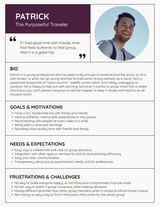
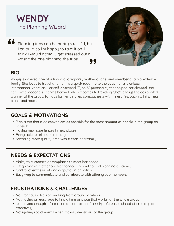
User Personas
Using the insights I gathered and evaluated, I created personas to bring my users and their motivations to life. Because I needed to think about the perspectives of multiple parties I created four different personas representing different types of members of a travel group. To ground them in an extra level of authenticity I also decided to give each a real quote from one of my user interview participants.
These personas would serve as my “North Star” when exploring different design solutions and decisions.


The Problem
DEFINE
With a much better understanding of the market, my users, and their needs, it was time to narrow the focus of my project by defining what problem I would be solving. I started with four potential problems:
Designated planners don’t have enough information early on to plan the trip efficiently
1
Group members don’t know what information is useful to provide to the designated planners
2
Finding a time and place to travel together that is convenient for as many people as possible is a seemingly impossible task
3
Less experienced travelers don’t have the knowledge to inform their planning decisions or preferences
4
Final Problem Statement
I’d like to explore ways to
help travelers better communicate their personal travel preferences and needs
because that knowledge is essential to preventing frustrations throughout the group trip planning process.
DEVELOP
User Journeys
Now that I knew what problem I would be focused on solving, I began ideating on my best approach. After brainstorming, I started mapping out the structure, hierarchy, organization, and relationships of my planned content and features, so that my users can easily navigate through my design to accomplish their desired goals.

Task Flows

User Flows
Wireframing
With a clearer picture of how my users would be navigating my design to complete their tasks, I was ready to put pen to paper and sketch out a variety of options and solutions to bring the experience to life in ways my users would find enjoyable and useful according to my research.

Lo-Fi Wireframes


Mid-Fi Wireframes

Plandemonium Branding
A play on the home of chaos and demons, “Plandemonium” sets out to do just that—turn a hellish experience into an enjoyable one starting with a playful name.
Core Values:
Fun
Collaboration
Adventure
Community
Curiosity
Confidence


Hi-Fi Mockups

Hi-Fidelity Prototype
Usability Testing
Tasks Tested:
Complete Travel Persona Quiz as New User
Vote on Trip Destination as Participant
Invite Guest to Existing Trip as Planner
Measurements of Success:
Task(s) Completed
User Satisfaction via Positive Feedback
Perception of Ease of Use
Perception of Usefulness
Perception of Enjoyment


Prioritizing Revisions
Changes were prioritized using the MoSCoW Method with a focus on what would help users complete tasks more efficiently.
Must Have
Redesign the “Your Trip (So Far)” trip details section to be optimized for mobile and not rely on hover states to reveal information needed for successful task completion
Give users the option to return to the trip details page rather than return to the portal home page after completing a to-do list item to continue the flow of completing tasks and focusing on a specific trip
Should Have
Create navigation for the Travel Persona Quiz from the user profile page to better match user expectations
Create a clearer connection between the items in the “Top To-Dos” and the trips they correspond to give users more context
Change “voted” to “selected” or another solution to make it clearer to users if/when they have an additional step to complete before their vote is fully submitted and the task is completed
Fix visual inconsistencies
Could Have
Add voting results to the vote submission confirmation page to give users real-time feedback
Create a write-in option for the voting functionality to give users an additional path that aligns with my persona’s needs
Will Not Have
Build out planner user sections to show customization/personalization capabilities
Kits shopping section
Revised Prototype
CHANGES
Adjusted “Your Top To-Dos” Component so the shapes are a consistent size to decrease any visual distractions
Changed the arrows in “Your Top To-Dos” and “Your Upcoming Trips” to progression dots to better indicate the sliding functionality to users


CHANGES
Gave the bottom button more prominence so the user can easily return to their trip after copying their personalized link if they choose that option
Changed CTA to drive users to return to the trip details page rather than the portal home page after completing their to-do list item to continue the flow of completing tasks and focusing on a specific trip


CHANGES:
Changed CTA to drive users to return to the trip details page rather than the portal home page after completing their to-do list item to continue the flow of completing tasks and focusing on a specific trip
Remove underline on “Ready for more Plandemonium?” because it appears to be a hyperlink when it is not and was confusing to users


CHANGES:
Changed “voted” to “selected” to make it clearer to users that while they have made their choice, they still have an additional step to complete before their vote is fully submitted
Removed the toggle button that reveals or hides the “fun facts” as users found it unnecessary and even distracting


CHANGES:
Created a new path so users could navigate to the Travel Persona Quiz from the profile page to better align with user expectations
Swapped the hierarchy of the CTAs on the quiz results page to allow users to continue their task flow by driving them to the main portal
Updated CTA from “Add to My Profile” to “View Updated Profile” as a secondary CTA as testing results indicated users are more likely to continue completing tasks than view profile


CHANGES:
Redesigned the “Your Trip (So Far)” trip details section to be optimized for mobile and not rely on hover states to reveal information needed for successful task completion
Added additional context to the default “Itinerary” tab state to aid in navigation


After launching the MVP, the next phase will focus on the physical Plandemonium Party Kits as a premium offering along with additional functionality needed according to research.
Shop Kits Page
Purchase & Checkout
Product Recommendation
Individual Kit Product Pages
Add-Ons + Customization
Trip countdowns
Voting results