Ollie’s
Market & Deli
A website redesign that rolls out the digital welcome mat to reintroduce a local business and its new owners in a way that builds trust and community engagement.
ROLE
- UX Designer and Researcher
- Copywriter
- Content Strategist
SCOPE
- Desktop & mobile website redesign
- Bridge in-store personality with online experience
- Create catering flow
TOOLS
- Figma
- Google Forms (surveying)
- Zoom (interviews and testing)
PROCESS
- Stakeholder intake
- User interviews
- Competitive analysis
- Feature prioritization
- User flows and site architecture
- Wireframes (lo-fi and hi-fi)
- UI design with brand alignment
- Usability testing & iteration
Background
A really great pastrami on rye from a deli down the street in fact. Ollie’s (the market & deli formerly known as Bennett’s) had just gotten a fresh coat of paint, a new name, and new owners in need of a fresh website to match. The site they did have was little more than a menu and the owners were worried the neighborhood wouldn’t embrace all of the change.
I worked with the owners, designing around the constraints of a third-party POS system and proposing new features, to reintroduce the deli, strengthen community engagement and highlight what makes Ollie’s special. Hint: it’s more than just the pastrami.
It all started with a sandwich…
Ollie’s Market & Deli
Grant Park, Atlanta, GA
Research
What’s working? What’s missing? What’s in this sandwich?
We weren’t starting completely from scratch, so I wanted to know what was already working well for current customers as well as what was missing from the experience. The owners and I chatted over coffee about what brought them to Grant Park, what they envisioned for Ollie’s future, and how I could help them achieve their goals.
It was clear more research was needed to identify who the Ollie’s website user was, and what their needs and frustrations were. I also needed to dig into what the competition was up to and how similar businesses’ websites were working alongside their third-party POS platforms.
Display I placed in Ollie’s to encourage real customers to sign up for user interviews
PROCESS
- Stakeholder intake
- Competitive and Comparative Analysis
- User Interviews
- User Survey
- Affinity Map
- Empathy Map
Checking out the competition
I looked at competitors big and small from chain grocery stores to other local delis with online ordering. And I noticed something interesting: a large number of local restaurants and markets used the same POS platform for online ordering resulting in a “sea of same” in the digital space.
The bad news: this left small businesses with less control over how they stand out in the market
The good news: this gave me a lot of opportunity (and ideas) to own the experience before users reached the online ordering experience
Research Goal:
Understand customers’ needs, behaviors, and pain points when interacting with online ordering and shopping. This will inform the design and functionality of a new website experience.
Method & Participants:
30-minute Zoom and in-person interviews
5 individuals who live in the area local to Ollie’s who are familiar with ordering and shopping for food like deli and market items online
User Interviews
Summary of Results:
I determined that while users want online ordering that is fast, easy, and mobile-friendly, it’s not just about convenience.
What keeps them coming back is the feeling behind it: a sense of connection to the people and place. They're happy to put up with a few quirks small businesses deal with if the experience still feels like their favorite neighborhood spot.
So I knew my design needed to be functional and full of charm.
“I will make compromises and sacrifice convenience...if they’re a business that I like and wanna support.”
“When stores highlight local ingredients or local partners...feels like I am actually supporting local and a part of my community.”
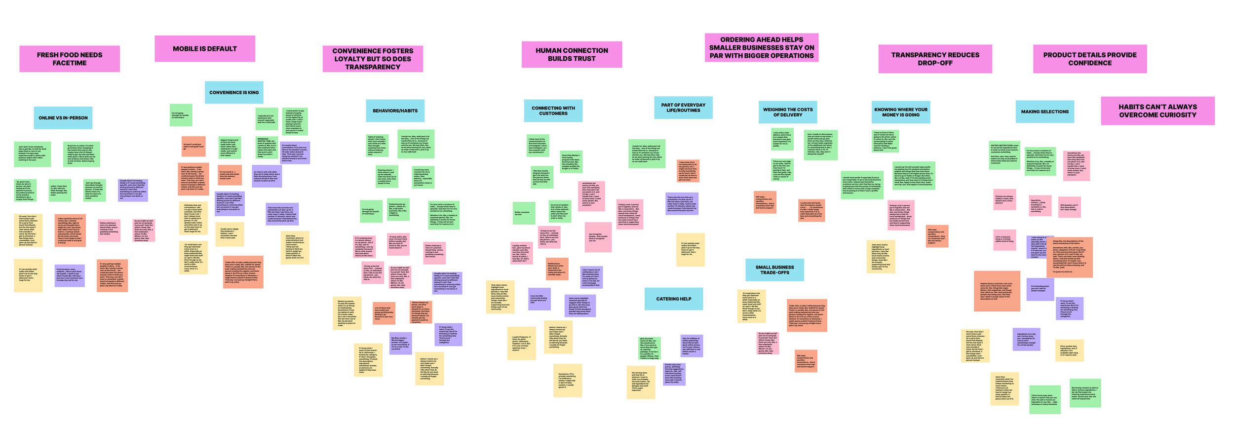
Affinity Map used to identify patterns and gather insights from my user interview observations.
-
Customers will stick with a platform that minimizes friction and saves time. Speed and simplicity are non-negotiable.
-
While digital, the experience shouldn’t feel impersonal. Customers value knowing there are real people behind the deli and will even adjust their behaviors accordingly when shopping small.
-
Unexpected fees or unclear pricing can break trust and lead to abandoned orders. But on the flip side, being honest about the tradeoffs of supporting small businesses (occasionally slower service, for instance), wins hearts and stomachs alike.
-
Customers expect a fast, intuitive mobile experience, not a scaled-down version of a desktop site. Online ordering is often done on-the-go and the experience needs to support that.
-
Clear descriptions and ingredient transparency drive purchase decisions, especially for customers with dietary concerns.
-
While customers love their go-to favorites, timely nudges about seasonal offerings or limited-edition specials can inspire exploration.
-
Some items, like fresh meats and produce, are still preferred to be shopped for in person, so the online offering should play to the strengths of pre-prepped foods, sandwiches, or curated selections.
Insights I gathered:
Empathizing with users
In order to gain an even closer view of the Ollie’s user I chose to conduct a contextual inquiry with one of my interview participants who I knew was a frequent customer (perks of living down the street) and create an empathy map of my findings.
This exercise greatly influenced my persona creation. Spoiler: As Yoda said, “two there are.”
Define
So now what? Who? And why?
I used the insights gathered from my user interviews and secondary research to create two clear personas that guided every decision I made. From there, I mapped out user and task flows to identify pain points and opportunities.
That’s when it clicked (no pun intended): while I may not have control over the online ordering experience, everything that happens before someone hits “Order Now” is my chance to build trust, reflect the Ollie’s brand, and create a meaningful connection with users.
This created a great opportunity to bridge business and user goals while working around technical constraints.
PROCESS
- User Personas
- User & Task Flows
- Site Map
- Feature Roadmap
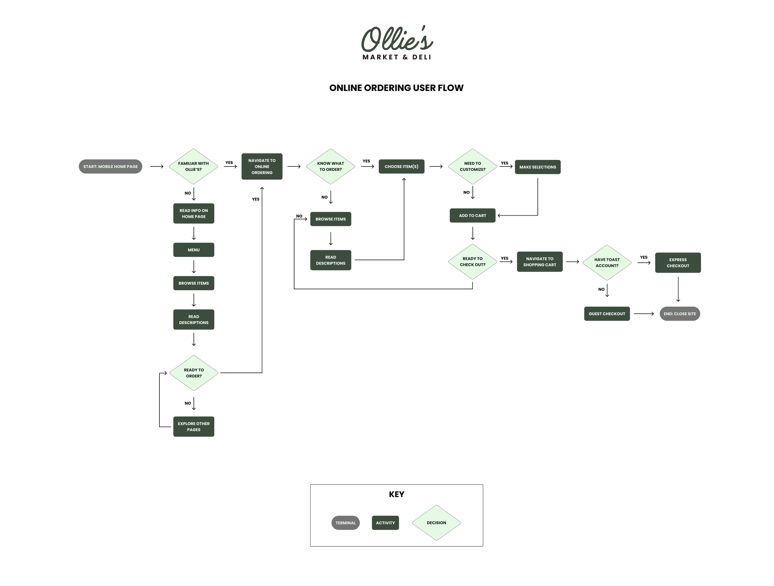
Ollie’s online ordering user flow
Meet the Ollie’s Personas

Greg
The Grab-and-Go Guest | Mobile User
Greg is a Project Manager in his mid-thirties with two young kids and a busy schedule. He and his wife rely on services like ordering pick-up and delivery online to help make the craziest days a little more manageable. He’s pretty tech-savvy and expects a fast, seamless mobile experience. Greg also loves the area his family lives in with so many walkable local businesses, which he tries to support as much as he can.
“If given the option, I’ll choose a local business every time. I always find better customer service, and I feel like my money is going into the pockets of someone who actually needs it versus a large corporation that is just posting it to their P and Ls.”
Needs & Goals
Pick up pantry items and meals on busy days quickly, easily, and on-the-go, occasionally with kids in-tow
A streamlined checkout process with mobile payment (e.g., Apple Pay) for fast, frictionless transactions
Plan efficiently around his family’s busy schedule while still leaving room for fun activities
To support a business that’s part of his community, knowing his money is staying local
Frustrations & Pain Points
Wasted time that could be spent more productively
Hidden fees and unclear pricing, especially when using delivery services
Special request notes being ignored after taking the time to put in a lot of detail
Bad or clunky mobile experiences
Not being able to customize things when his kids are being extra picky
Lack of clear, descriptive menus
Lucy
The Local Loyalist | Desktop User
Lucy is college professor in her fifties who prides herself on being an active member of her community and an advocate for small business owners. While she loves chatting with her neighbors and knows everyone behind the counter by name, she relies on online ordering as the semester gets busier and her days get longer. While she’s comfortable with mobile ordering and values convenience, Lucy cares more about the quality of the food and feeling connected with her community, so she doesn’t mind popping in for a visit.
“When I visit shops that highlight locally-sourced ingredients or products, I love the little community feeling I get.”
Needs & Goals
Know where the products and items she chooses to buy are sourced from
Build genuine relationships with small business owners and their employees
Help preserve local history and neighborhood personality by being an advocate for her community
Flexible options as her schedule changes regularly
Feel like she’s supporting her community, even if her busy schedule requires her to order online
Frustrations & Pain Points
Online experiences that feel impersonal
Lack of clear communication or expectations
Local businesses that don’t make an effort to be active in the community
Surprise fees or hidden costs that feel misleading
Having to guess about timing when ordering online and not being able to plan her day effectively
With a clearer picture of the “who” and the “why”, it was time for the “what” and the “how.” My problem statement would keep me focused on the solving the right problem for the right user.
The Problem
How might we elevate the Ollie’s online ordering experience to reflect the warm, personal touches that the in-store experience delivers in order to make it feel less transactional and more like an optimized opportunity for users to become community champions with every purchase?
[cue Jeopardy! theme music]
Ideate
My Bread & Butter
No, I’m not talking about sandwiches again. Ideation is my sweet spot. With a background in advertising and brand storytelling, I thrive in the early stages of any project, connecting emotional insights to strategic concepts that feel distinctly human.
For Ollie’s, I wasn’t just designing for usability; I wanted the site to reflect the in-store experience. That’s how features like the community events calendar and Bite of Good came to life. These ideas were built to foster trust, neighborhood charm, and connection, even within tight technical constraints.
PROCESS
- A lot of brainstorming and scribbling
- Low-fidelity wireframes
- Low-fidelity user survey
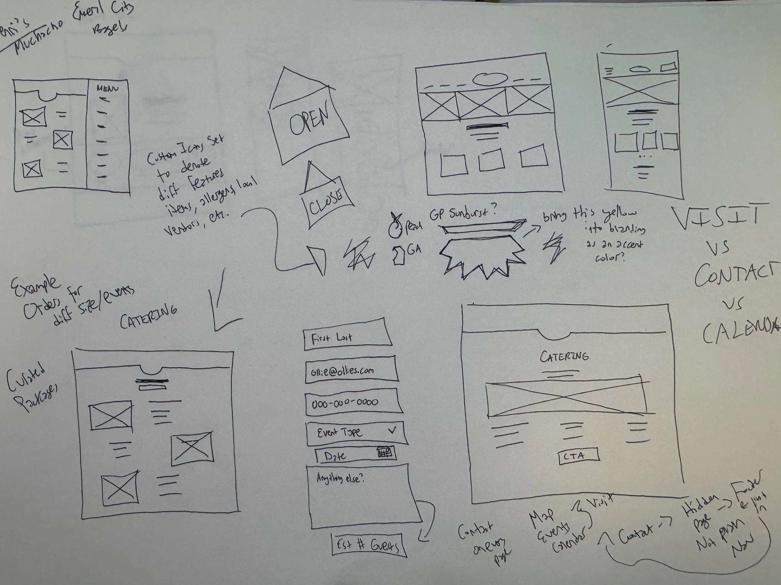
Sometimes ideation looks like messy sketches. Sometimes it’s lists in the Notes app (okay, a lot of times it’s lists).
Low-Fidelity Wireframes
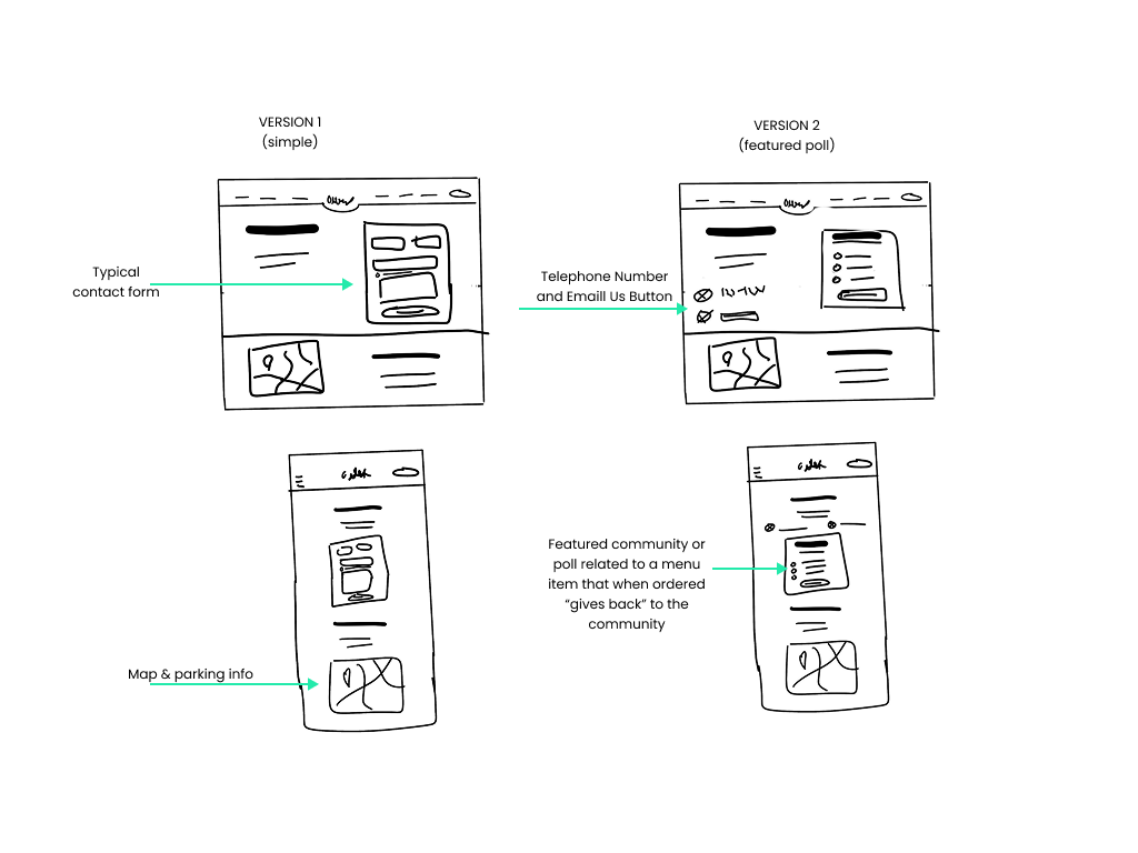
Contact Us Page
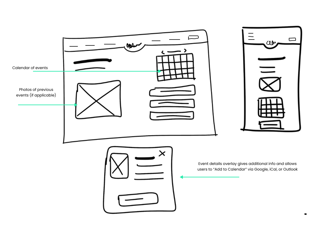
Visit Us/Community Events Page
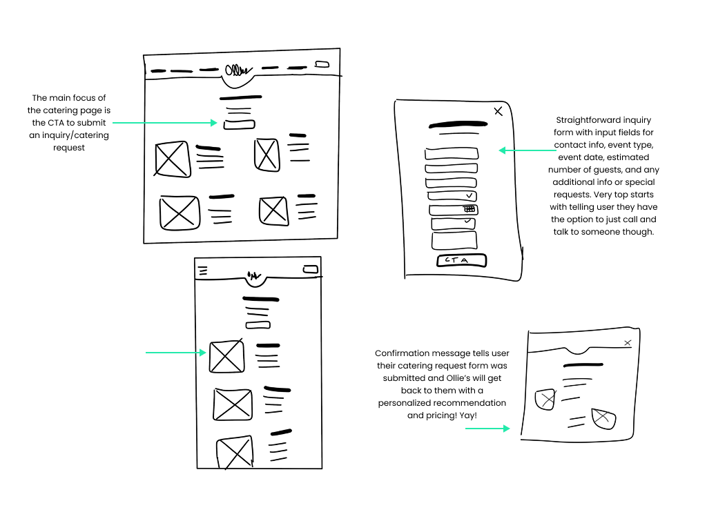
Catering Page
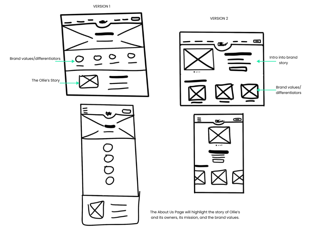
About Us Page

Menu
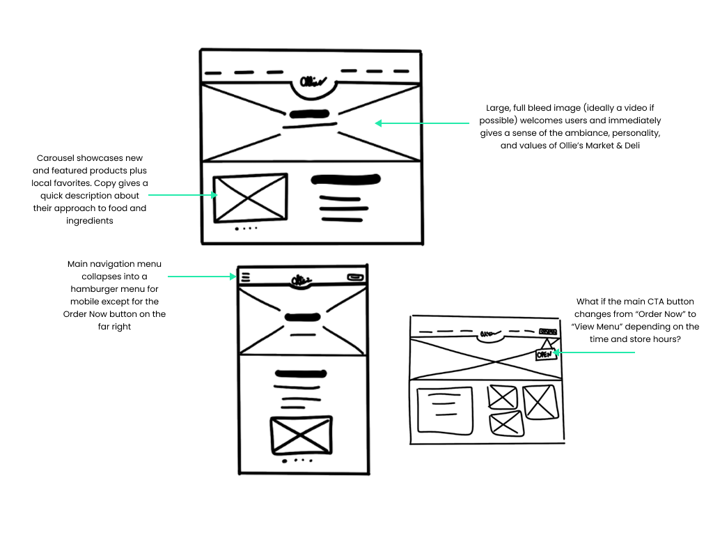
Home Page
Ideate
Validating ideas through testing
Using my low-fidelity wireframes, I tested the overall flow, navigation, and general user understanding of my Ollie’s responsive web design as well as its level of “community connection” with users. The feedback received helped me improve my designs as I moved into higher fidelity.
Methodology:
- Unmoderated user survey with follow-up conversation for clarification purposes
- 5 participants from user pool
“Makes me feel like they actually took the time to think about their neighbors and who they are serving”
Overall, users felt the proposed features offers a strong sense of community connection (4/5)
Reported Ease of Use
Contact Us Page Preference
About Us Page Preference
“Love the addition of photos & the ability to add stuff to my calendar”
The community events calendar was cited by all 5 participants as a key feature to building a sense of community.
Actionable Insights I Gathered:
The community-first mission can be further emphasized across the site (e.g., homepage tagline, About Us copy).
Where appropriate, users would enjoy seeing testimonials or neighborhood spotlights to reinforce this perception
Enhance Community Events Calendar where I can:
Keep photos and “Add to My Calendar” features prominent.
Explore adding RSVP, reminders, or share functionality to increase engagement.
Consider giving the calendar more visibility (e.g., link from homepage banner or footer)
Users liked the idea of the “featured poll” but felt it was out of place on the Contact Us page
Move forward with About Us Version 1 with a focus on simplicity and community-driven personality elements
Move forward with Contact Us Version 1 without the featured poll
Design
Bringing it to life
Designing for Ollie’s meant balancing what was possible now with what the new owners envisioned for the future. With a third-party ordering system and existing store operations in place, I focused on what I could influence: clear messaging, thoughtful visuals, and community-first features grounded in research.
My approach leaned heavily on content strategy—shaping language and layout to guide users, reflect Ollie’s personality, and build trust. From an “if you know, you know” sunburst icon inspired by local signage to concepts like the Bite of Good program, every touchpoint was designed to inform and connect. I also built a simple catering experience from scratch, ready for future rollout.
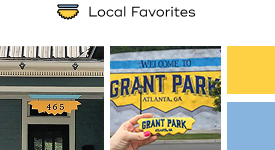
For the Local Favorites icon I drew inspiration from real neighborhood signage to give regulars an “IYKYK” nod and help newcomers feel at home.
I knew from conversations with the owners that Ollie’s didn’t have any set brand guidelines, so one of the first things I did was audit the existing site for typography, colors, and photography that could be repurposed. This rough style tile blends those original assets with refined additions to create a visual language that feels warm, fresh, and true to the vision the new owners had for Ollie’s next chapter.
PROCESS
- High-fidelity mockups
- Iconography design
- Existing brand audit & alignment
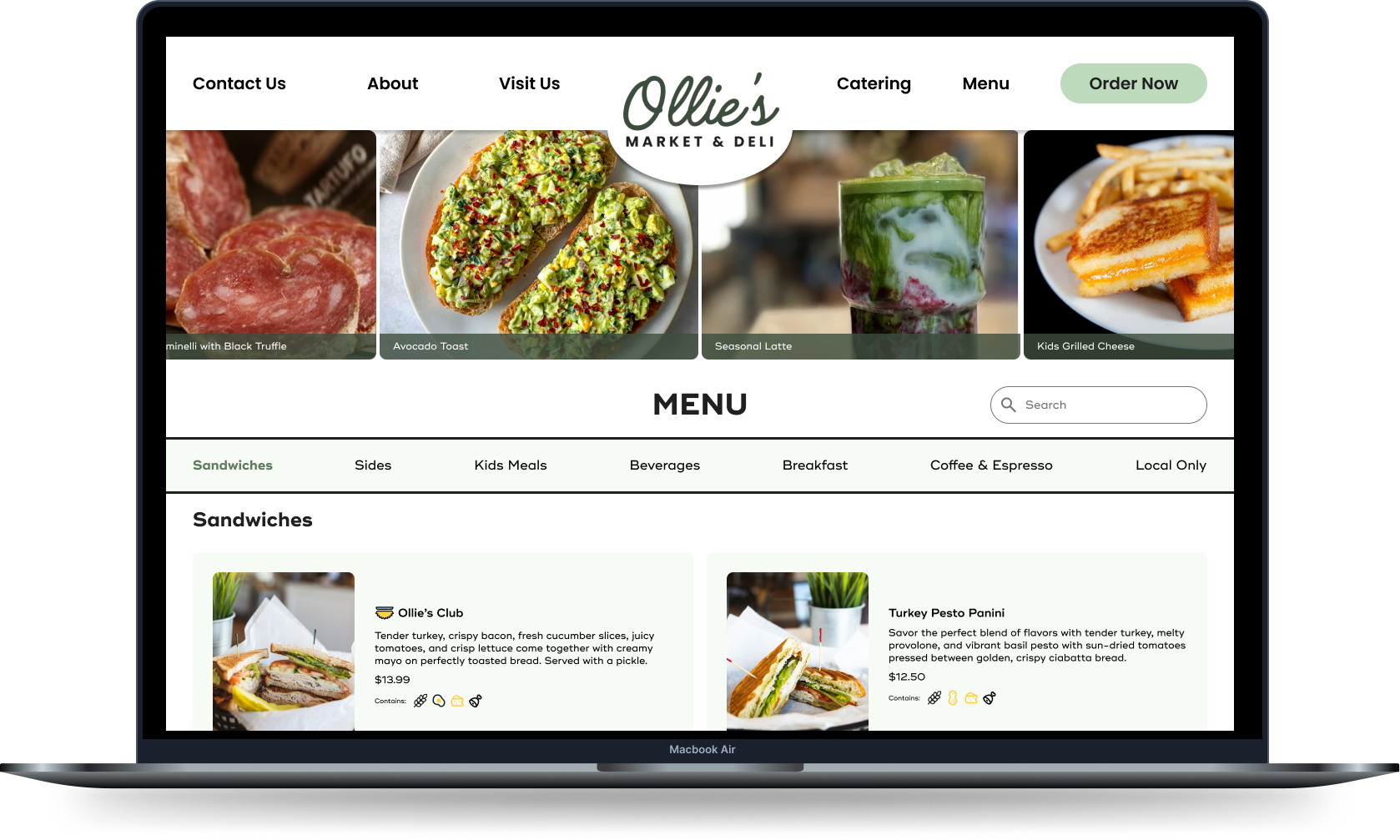
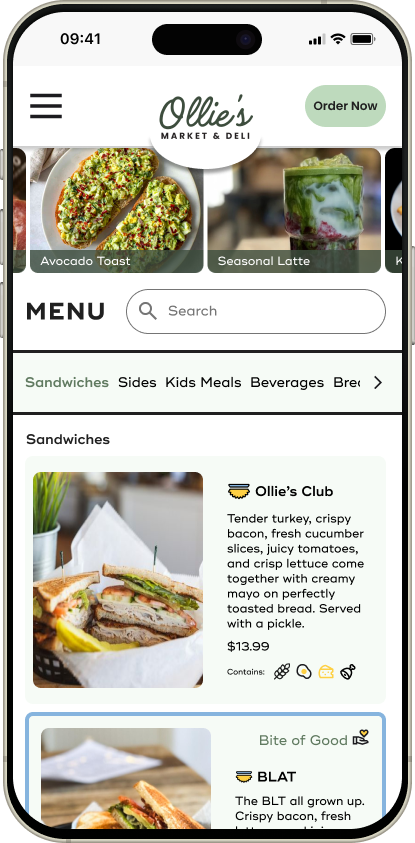
High-Fidelity Mockups
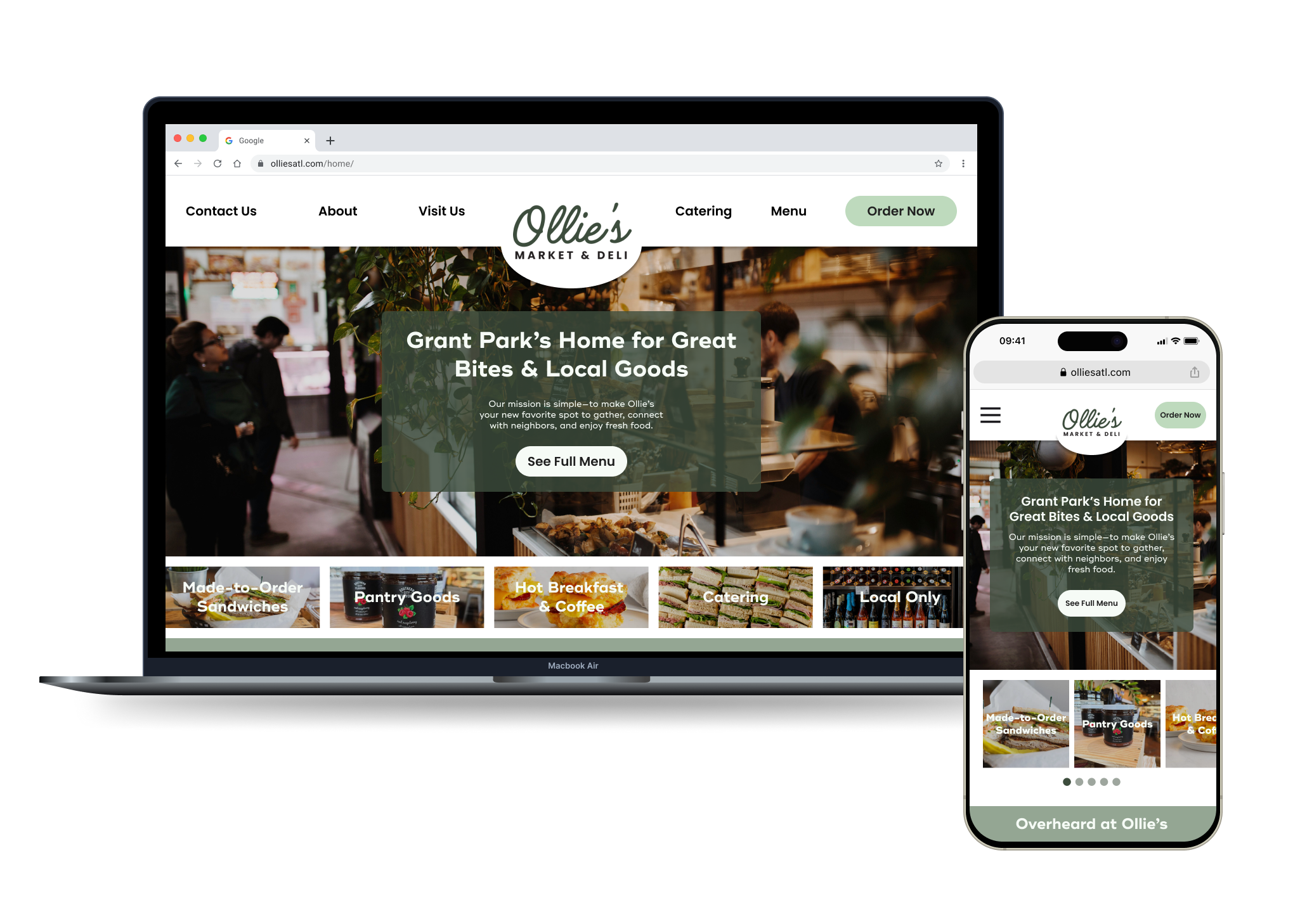
Home
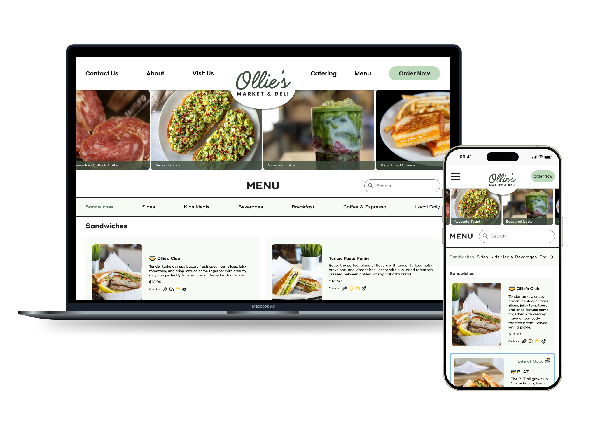
Menu
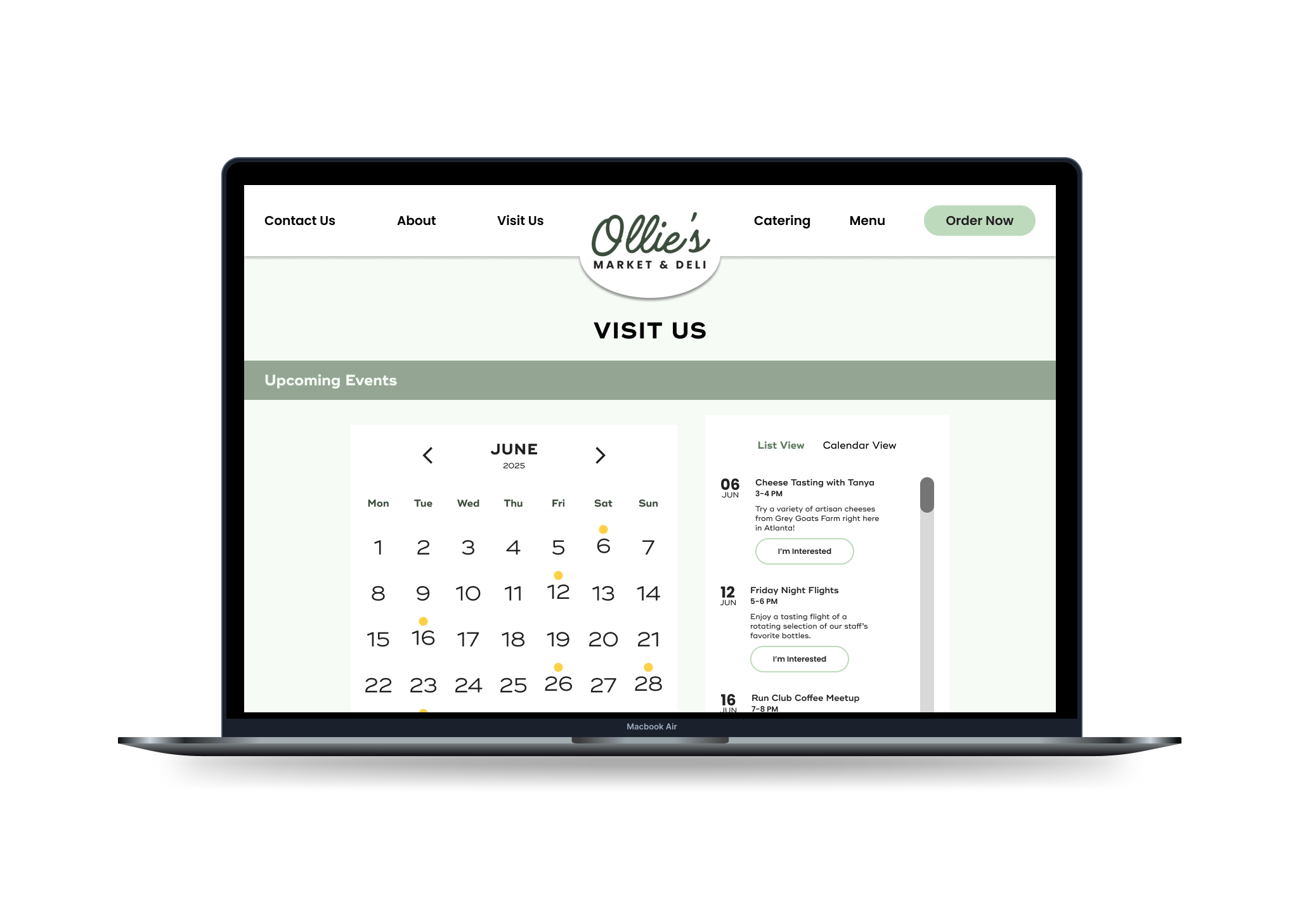
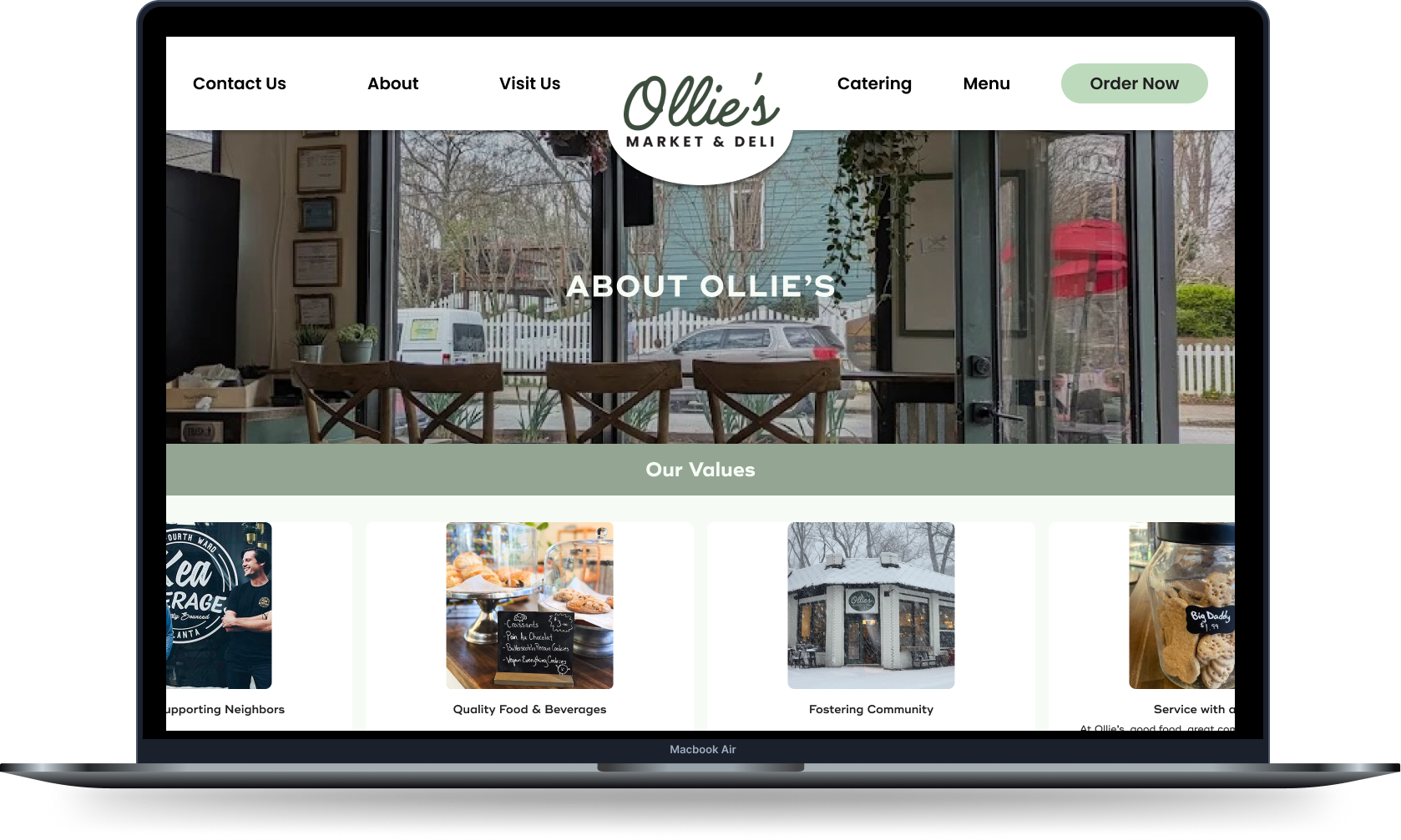
Visit Us page
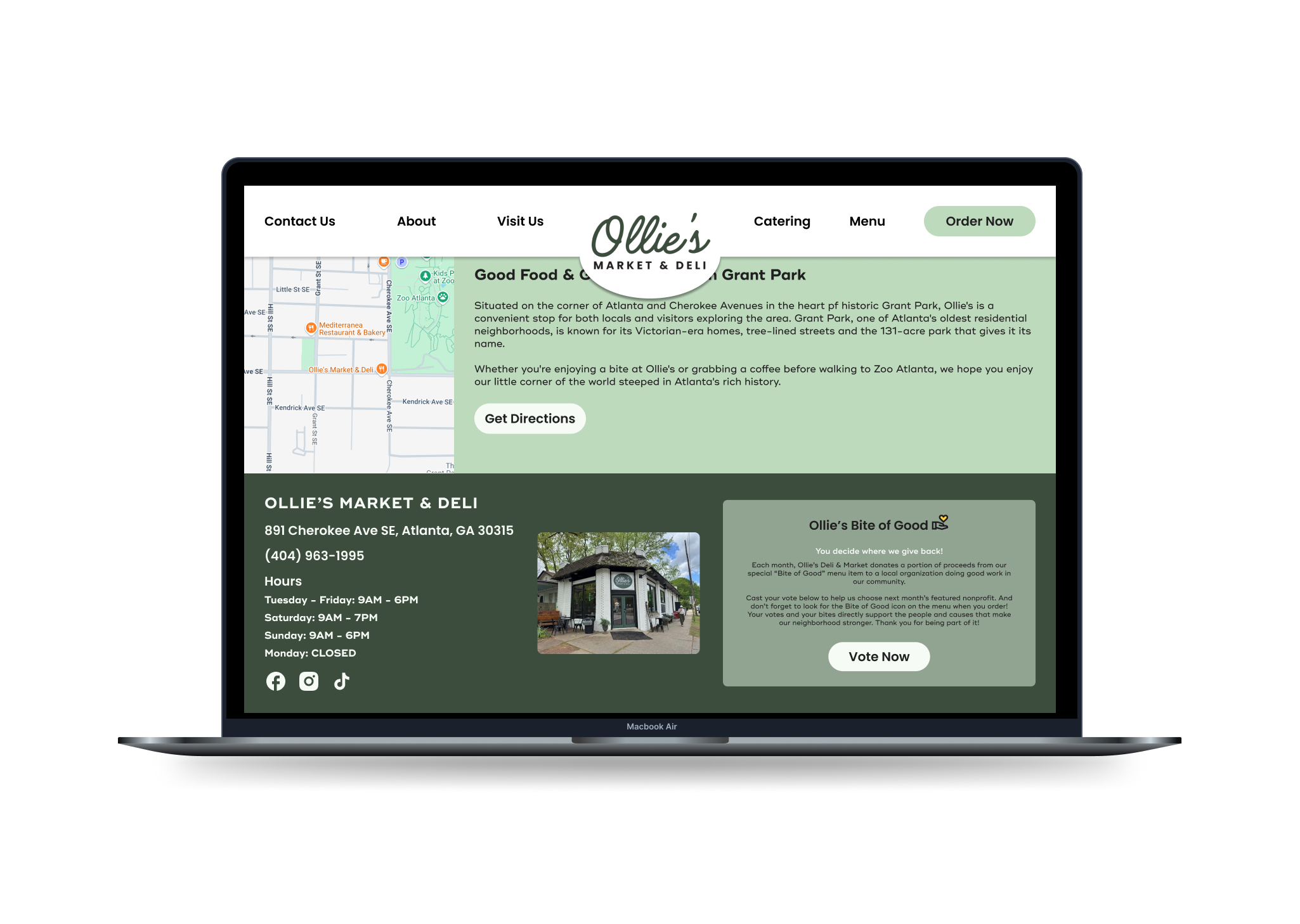
Visit Us page continues with Bite of Good footer feature
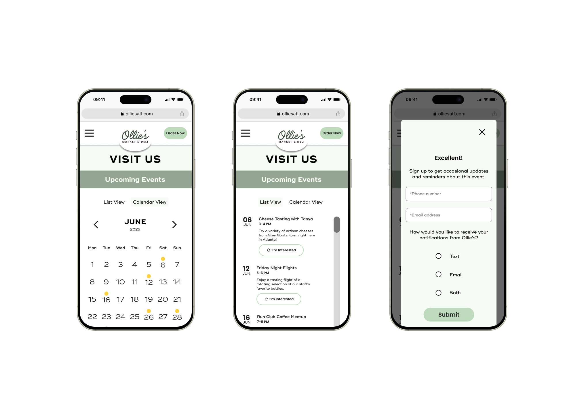
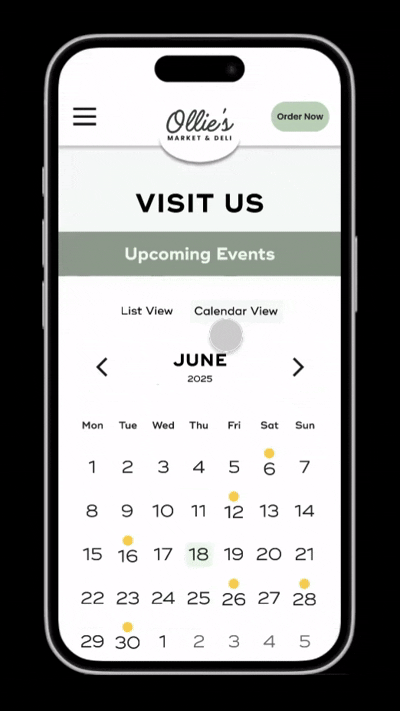
For the mobile Visit Us page users can toggle between list and calendar views. Button drives to event notifications signup form.
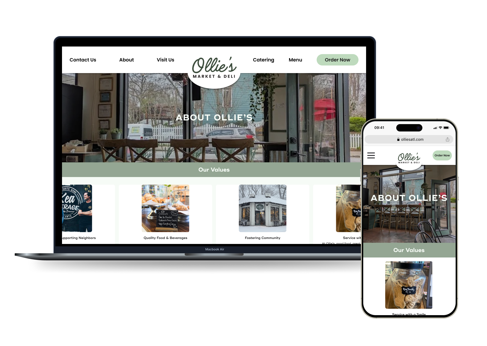
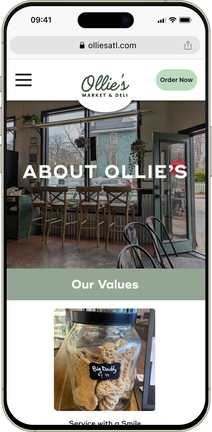
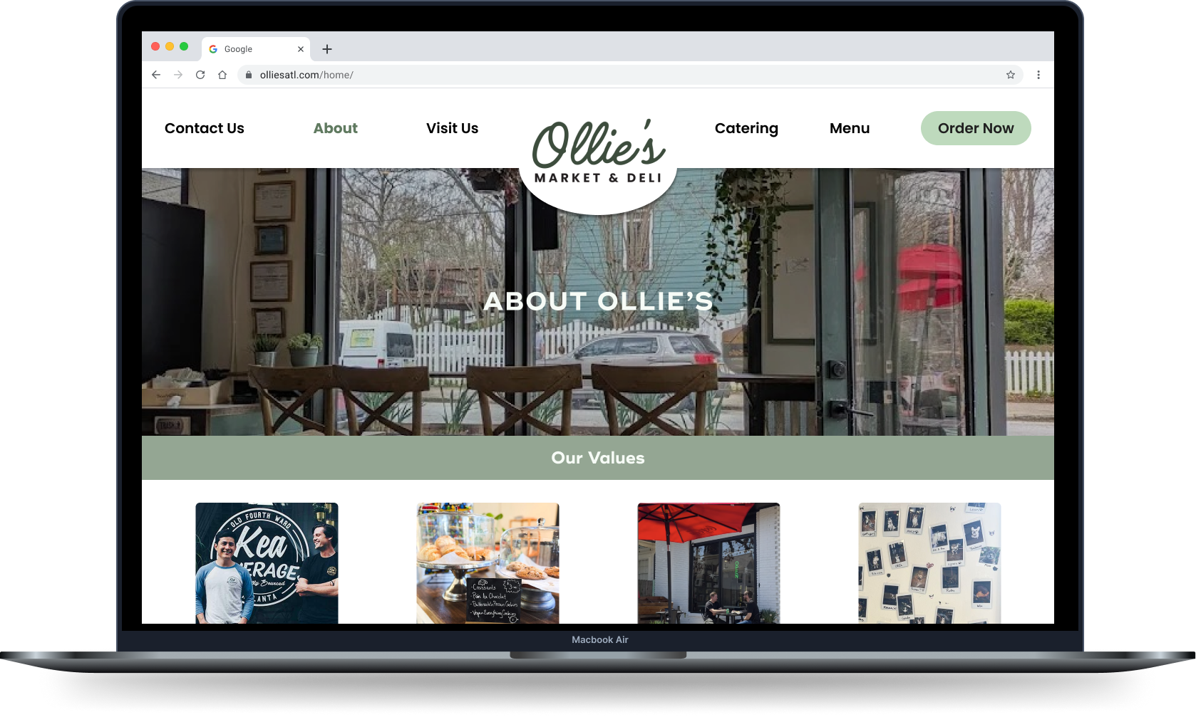
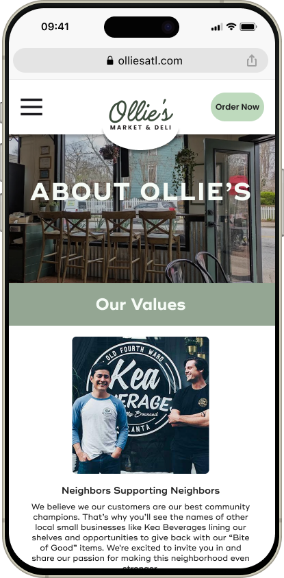
About Us page
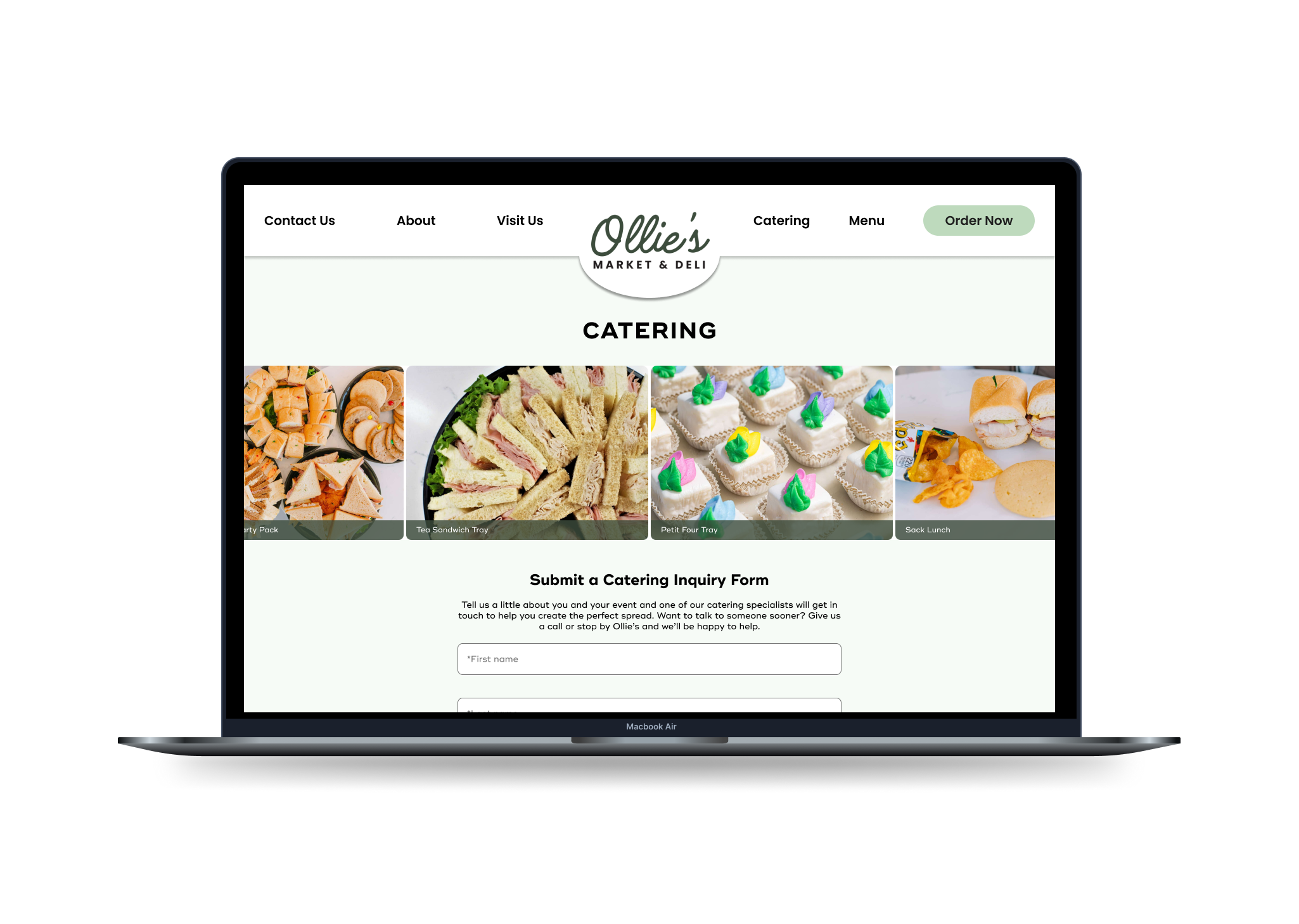
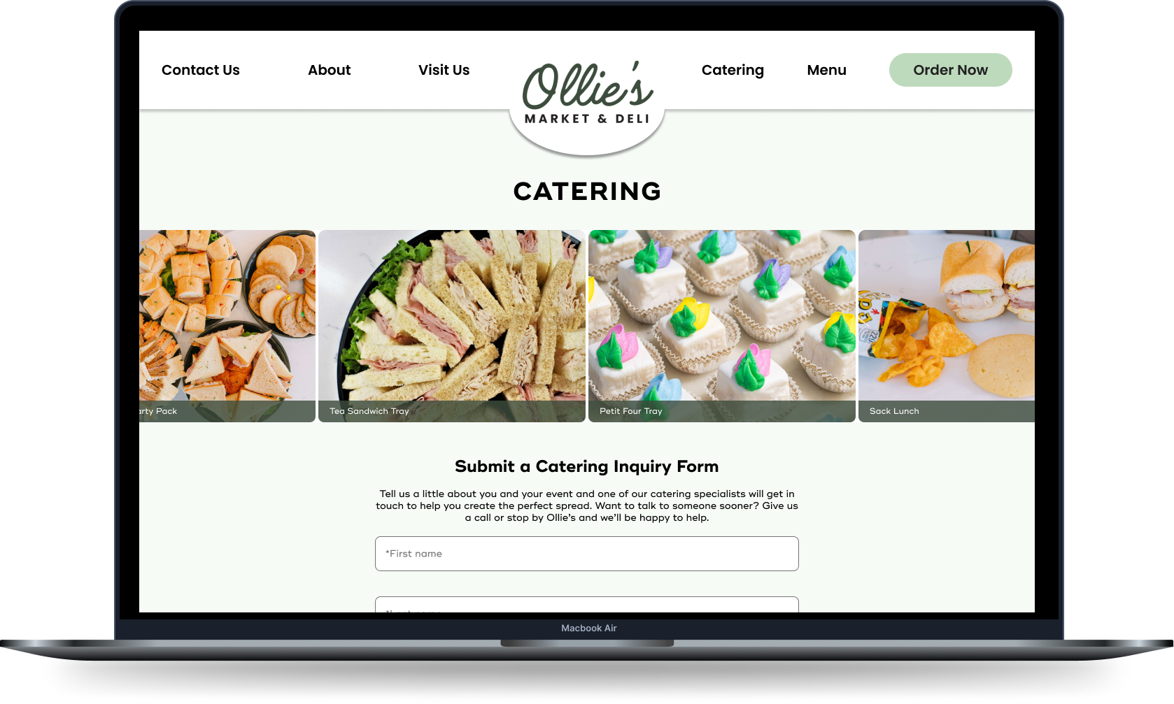
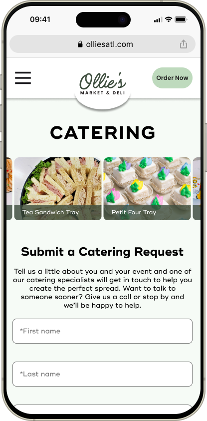
Catering page with inquiry form
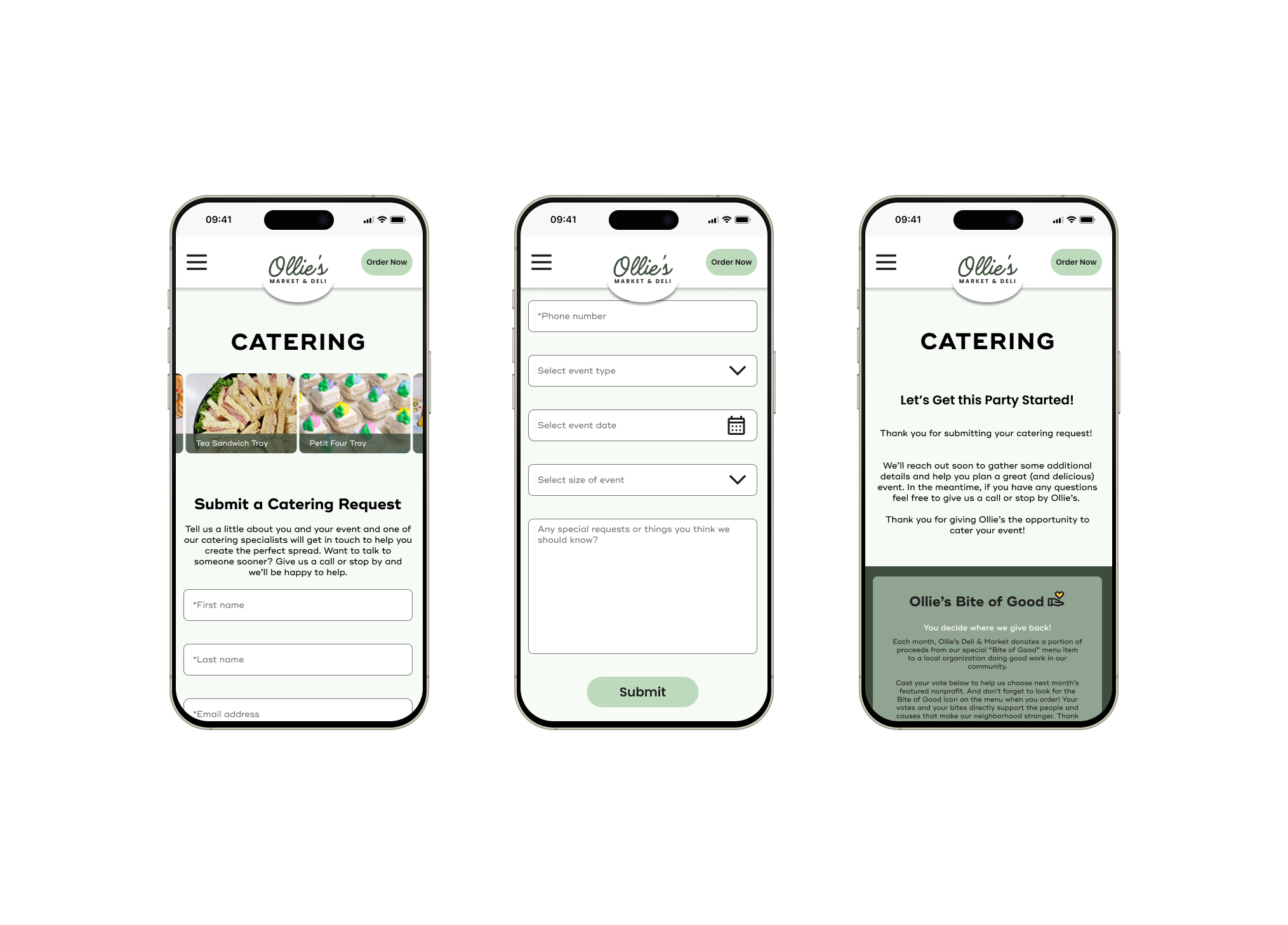
Catering inquiry form and submission confirmation page
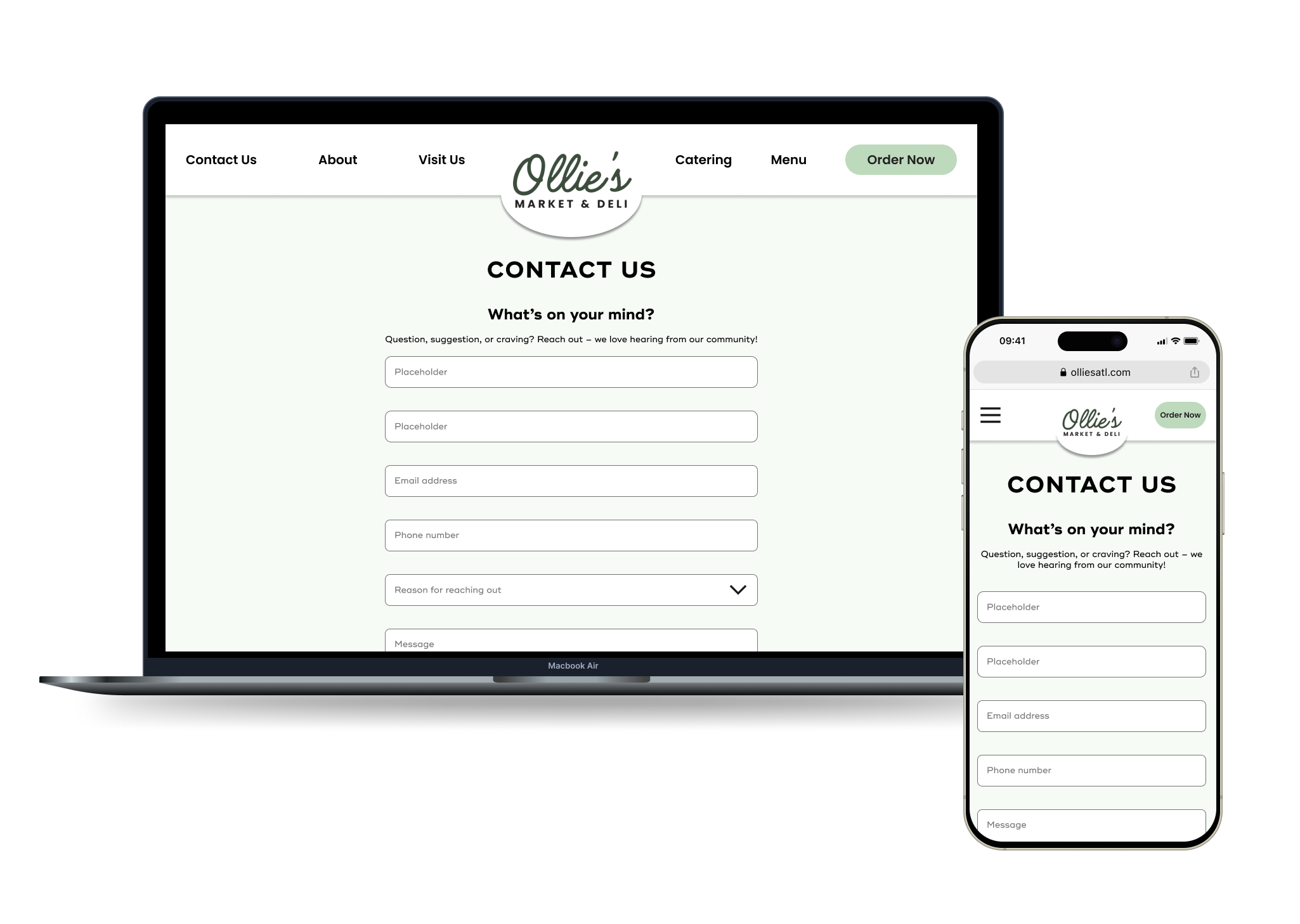
Contact Us page
Test &
Iterate
Is it Usable? Useful? Enjoyable?
To evaluate how well my Ollie’s website design supports user needs and reflects the business goals, I conducted usability tests with five participants aligned to my two core personas. Each participant was asked to complete four tasks while I observed for points of confusion, ease of use, and engagement.
The goal wasn’t just to assess usability, I also wanted to gauge emotional resonance. Could users navigate easily and feel that community-driven charm I’m aiming for?
What I tested:
Submitting a catering inquiry
Browsing upcoming events
Locating allergen information
Voting for a nonprofit to support
What I measured:
Task completion rate – Were users able to complete tasks without help?
Time on task – How long did it take to complete each task?
Error rate – Where did users stumble or misunderstand the flow?
Self-reported ease of use – How easy did tasks feel on a scale of 1–5?
Clarity of content – Could users confidently understand event details, allergens, and voting instructions?
Engagement and trust – Did users feel motivated to participate and connected to the Ollie’s brand?
Usability Testing Results
WINS
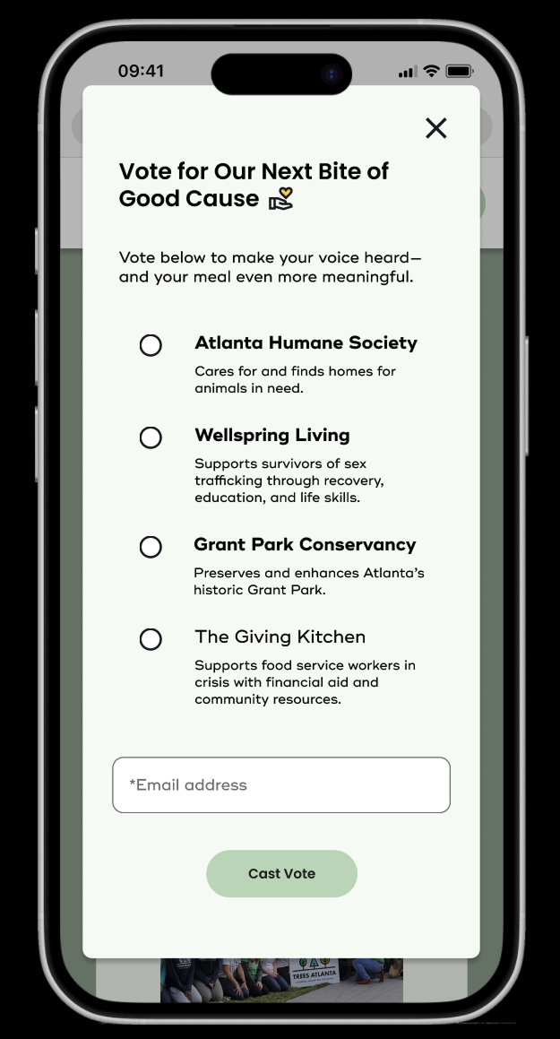
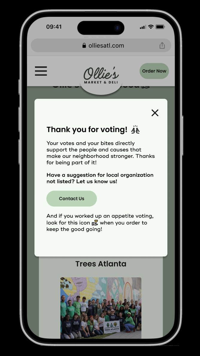
“Bite of Good” Voting - Fastest, most intuitive task; users loved the community connection.
Catering Form Design - Clear, well-labeled, professional look inspired user confidence.
Events Visibility - Users appreciated that events were front-and-center on the homepage.
Mobile Experience - Scroll-friendly forms and toggle views made mobile interactions easy.
OPPORTUNITIES
Catering Menu - Users wanted catering options before the form (“What can I order?”).
Calendar Functionality - Some users forgot dates or found the calendar view slightly clunky
Allergen Icons - Icons were unclear to some users; particularly the meat icon.
Label Clarity - Words like “soon” and menu item names raised small but avoidable questions.
SURPRISES
Emotional Stickiness - Users said the nonprofit vote made them feel like part of something bigger.
Desire for Extra Context - Users sought additional clarity (like menu content or specific donation amounts) even in simple tasks.
Hold the Meat Icon: Almost all of my participants noticed an icon on a vegetarian sandwich that indicated it had meat in it. It was a “Boolean slip” on my part, but turned out to be a great test of how identifiable and prominent the icons were (or not). That feedback helped me refine the icon system and make it more intuitive.
Priority Revisions
With my usability test results, project goals, and user personas in hand to ensure I focused on what was most important, I prioritized revisions based on impact and effort choosing to tackle the following High Impact/Low to Medium Effort revisions first:
About Us Page +
Bite of Good Feature
↓
What Changed:
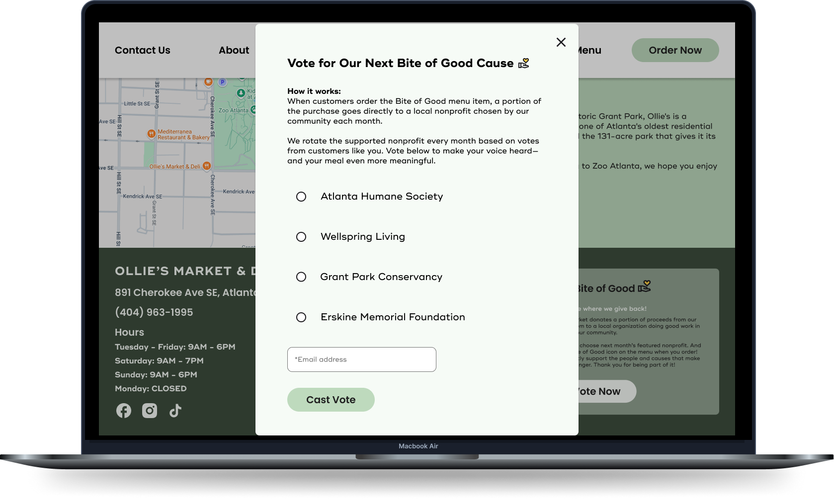
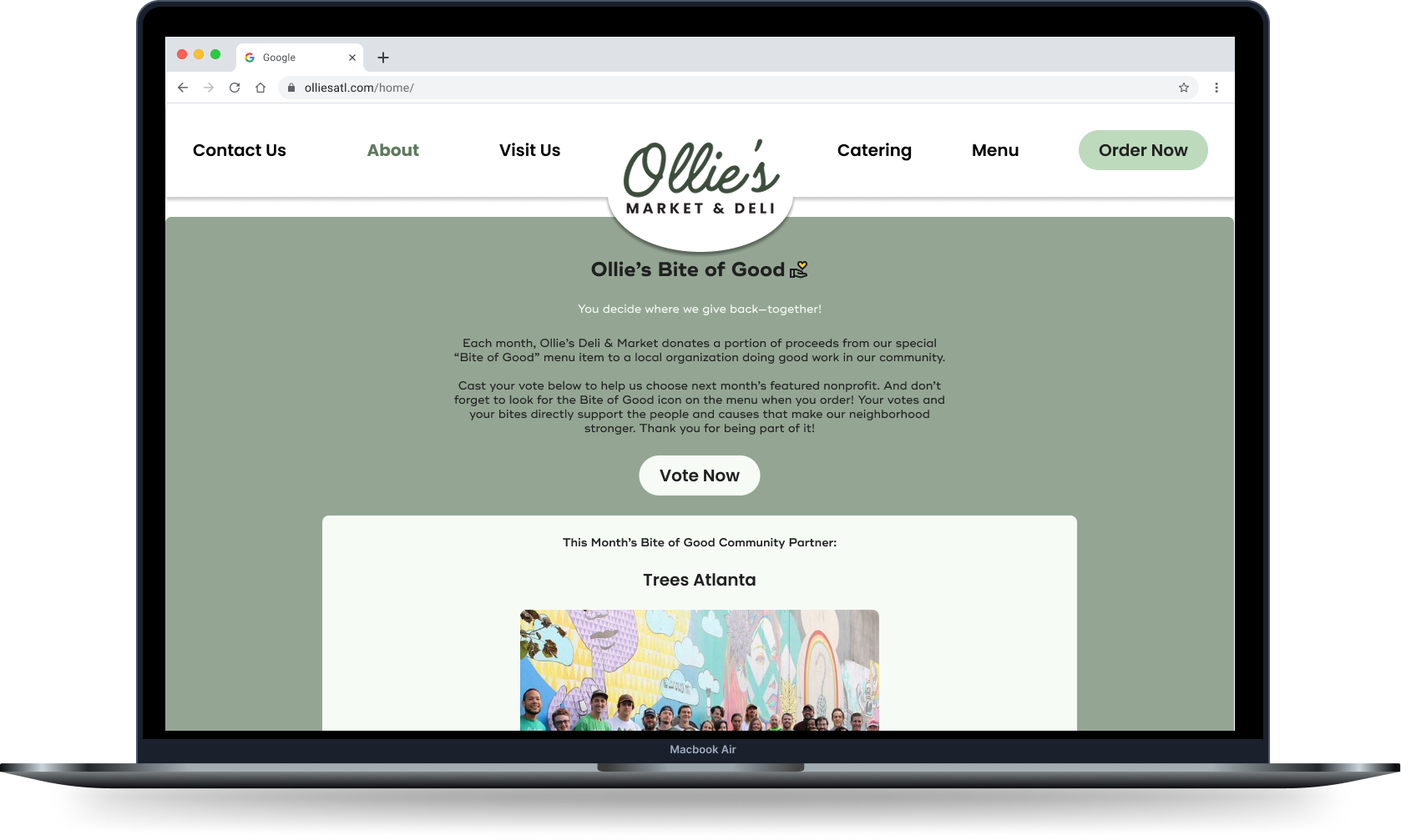
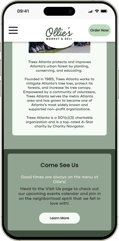
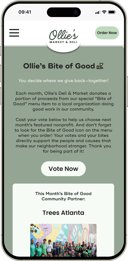
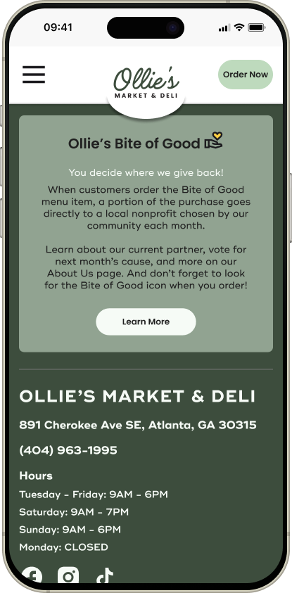
With the overwhelming interest and support for the Bite of Good program and website feature expressed during testing, I graduated it from the footer and created a dedicated section on the About Us page that includes a place to highlight the current cause Ollie’s is supporting.
To reflect this change, I updated the footer to be a more general message about the Bite of Good and drive users to the About Us page to learn more. On the About Us page, that part of the footer is replaced with a Visit Us page feature to avoid redundancy.
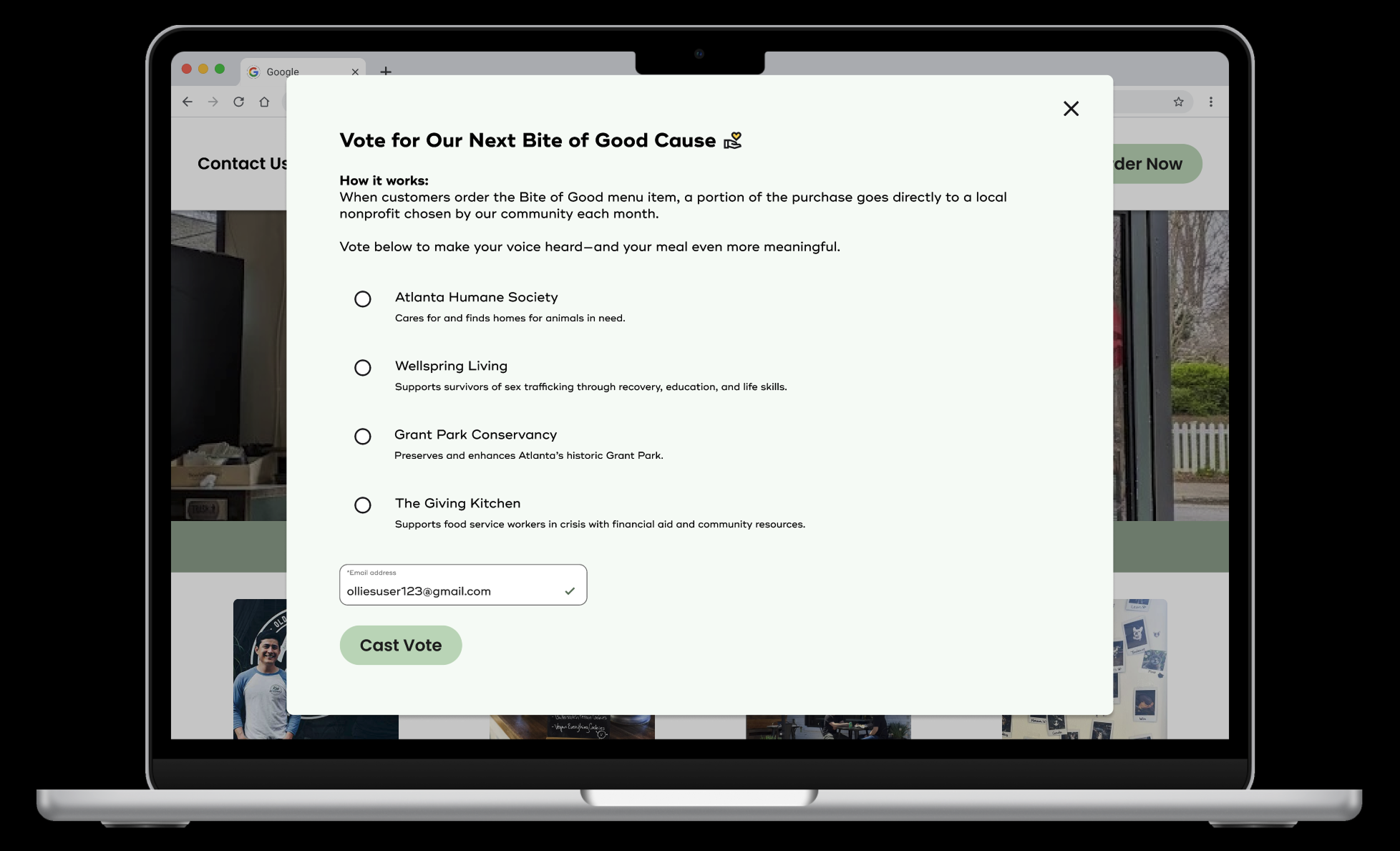
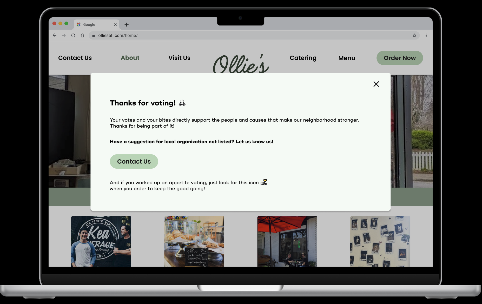
For the voting functionality I added short descriptions for each option. When discussing during usability testing, users suggested linking out to each individual non-profit’s website, but I wanted to keep the experience localized and save them from any additional effort. I also added the Bite of Good icon to the voting confirmation overlay so users could more easily identify it.
Menu Cards +
Allergen Info Iconography
↓
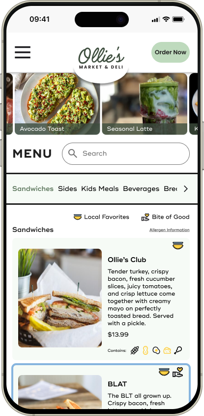
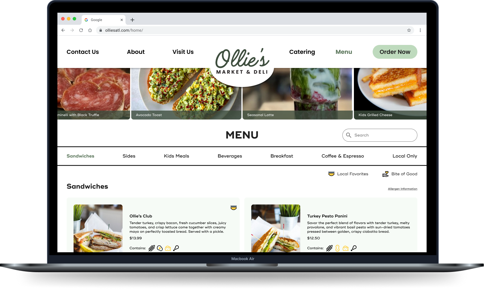
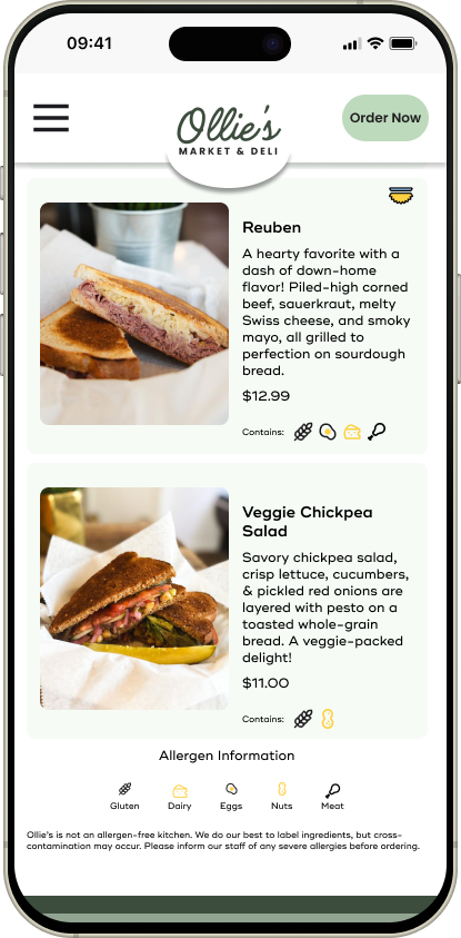
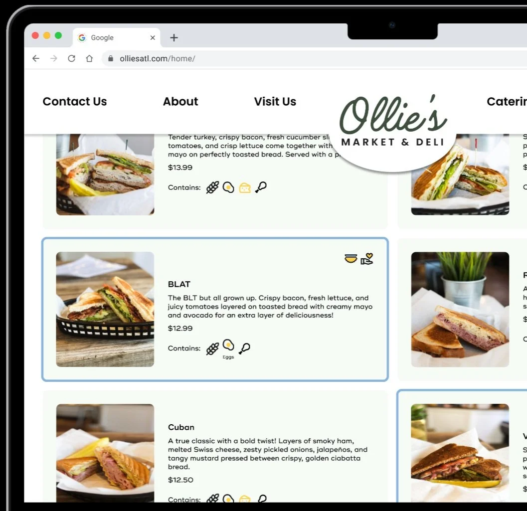
What Changed:
I improved allergen info clarity by increasing icon size on desktop and updated the meat icon to a more recognizable drumstick :)
Additionally, while I considered adding labels or an anchor link from the menu card to the bottom of the page where the key is, I decided a user that needed clarification would be best helped by having that information on the menu card itself. So for the desktop mobile I implemented a hover state that shows the labels. This solution wouldn’t work for mobile since the user’s finger would block the helpful information, so I opted for the text link driving to the allergen info key on mobile. I decided to add that functionality to the desktop version as well as extra functionality for clarification. These are changes I would like to test further.
Finally, I added a Bite of Good and Local Favorite icon key to add extra clarity around icon meanings earlier on in the page. The Bite of Good key is a text link that drives users to the footer where they can learn more about the program.
Catering Page
↓
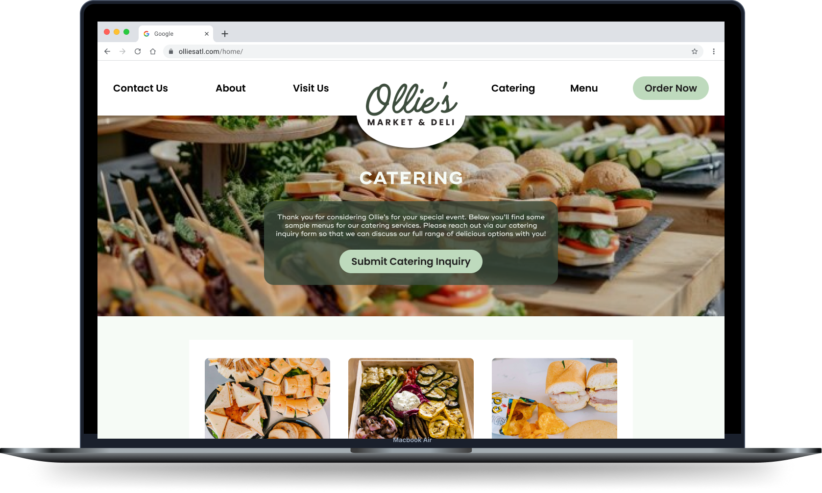
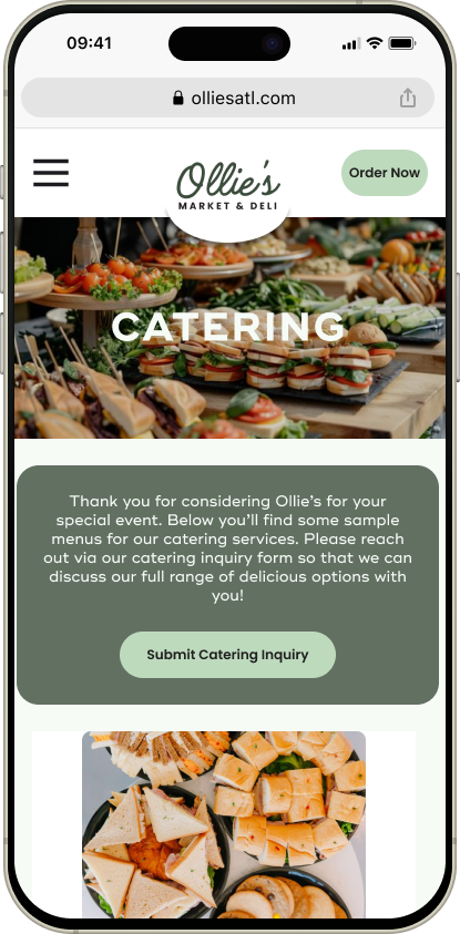
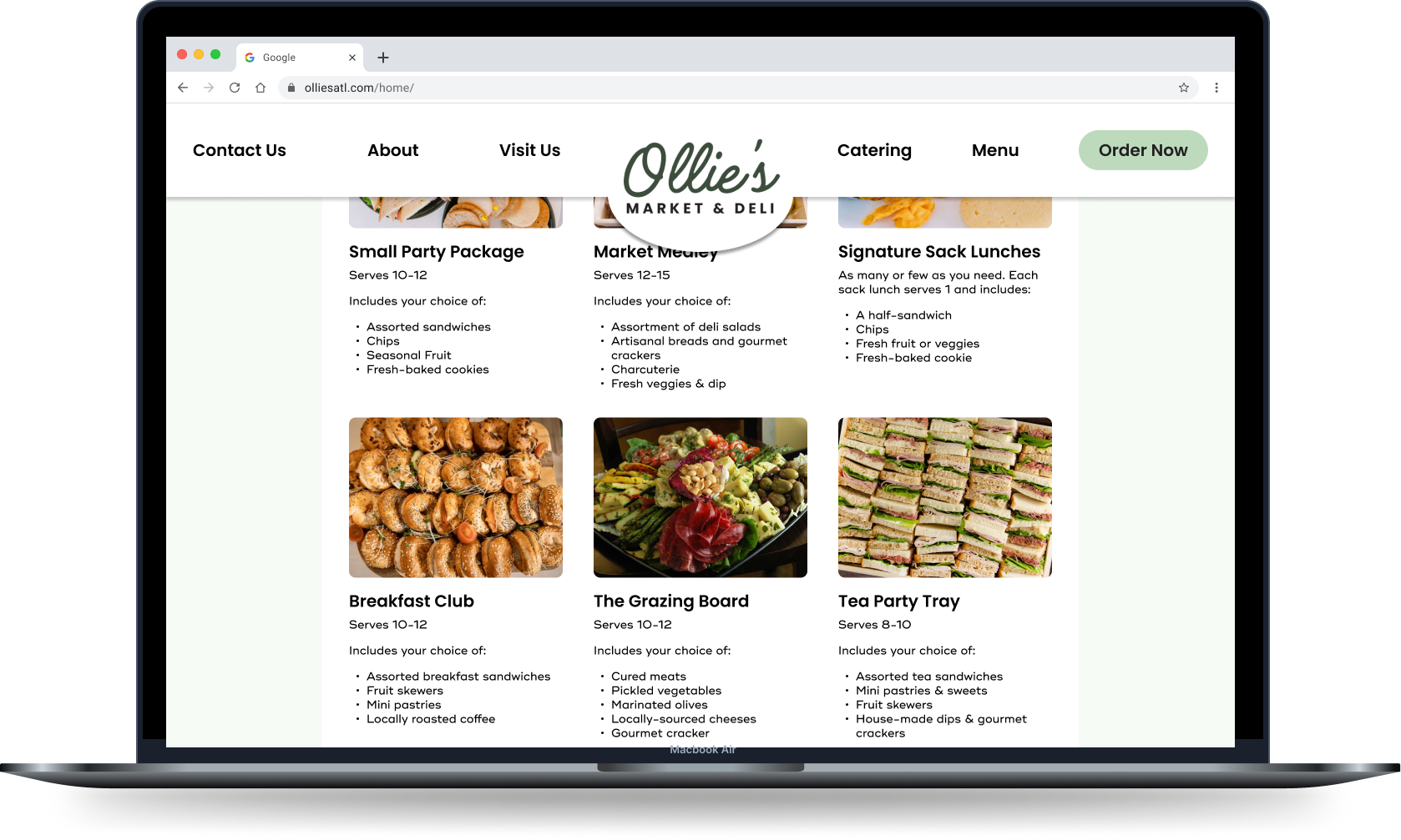
What Changed:
I added sample catering menu options before user submits inquiry in order to increase confidence, trust, and drive more submissions
While that was the original intent of the image carousel, it’s clear from usability testing that it wasn’t effective enough and I needed to design a dedicated menu.
But I wanted to ensure users could still quickly submit an inquiry so I added a button to the top of the page that scrolls directly to the form when clicked.
Final Prototypes
And that’s a wrap
This project was a chance to blend my new UX skills with my advertising experience. Features like the "Bite of Good” program and events calendar underscored how thoughtful content and brand personality can deepen user connection when strategically paired with user-centered design.
While much of what I designed for Ollie’s is for future endeavors as they expand their offerings expand to include things like catering, I plan to continue working with them to help make it a reality.