Plandemonium
A web application that makes group travel planning a little less “hellish” by allowing groups to personalize and game-ify the experience.
ROLE
UX Designer and Researcher
Copywriter
Content Strategist
Travel Planner :)
SCOPE
MVP design for a web application
Branding, core features, and high-fidelity prototype
TOOLS
Figma
Google Forms (surveying)
Zoom (interviews and testing)
PROCESS
Competitive analysis
User interviews
Feature prioritization
User flows and site architecture
Wireframes (lo-fi and hi-fi)
Branding
UI design
Usability testing & iteration
Background
Are we there yet?
While perusing the internet I found that most travel sites and apps catering to large groups primarily focus on appealing to young adults planning bachelorette parties or adrenaline fueled adventures.
But I also found that as people continue to make up for the “togetherness” lost during the COVID pandemic, more and more families were looking for ways to travel together.
Research
Get in. We’re going researching.
From my own experience I know that indecision, breakdowns in communication, and lack of consensus among other things can make planning a group trip particularly frustrating, especially for the appointed planner. But since we don’t design for ourselves, more research was needed.
PROCESS AT A GLANCE
Competitive Analysis
User Interviews
Affinity Map
Research Objectives
Travel panning is a broad topic with many factors and parties to consider, so it was imperative my research helped me understand:
How multi-family or group trips differ from single family trips
Why people would choose to use a travel agent or not to plan a multi-family or group vacation
How people currently plan multi-family or group trips and why
Where people get inspiration for multi-family or group trip destinations
How often people take multi-family or group trips compared to single family trips and why
What roles naturally form during the multi-family or group trip planning process and why
Learn what tools already exist and how we can differentiate ourselves in the market
Competitive Analysis
From analyzing both direct and indirect competitors, I saw several key opportunities to bring into my design:
Features with polls or voting to promote group collaboration
Trip inspiration or guidance for less experienced travelers
Mirroring or integration with other apps, sites, or services that travelers are already using and have affinity for
User Interviews
To better understand the real experiences people have had with group travel planning, I recruited 6 participants for user interviews.
I focused on asking open-ended questions about their experiences with travel planning, general travel, multi-family travel, and other group planning participation to learn as much as possible about my users and their goals. Here are a few key findings and notable quotes from particpants:
Research Goal:
Method & Participants:
30-minute Zoom interviews
Summary of Results:
“There is no good way that I keep track of things”
“I’ve definitely put myself in more than one pickle..like I’m in over my head.”
“Your only experience is the house you grew up in”
“YouTube is amazing...that’s a major resource for home repairs for me.”
“We have a side quest list on the the fridge that, if something pops up that we need to take care of, we’ll add it there and try to tackle it whenever we have some bandwidth.”
Side quests, huh? Light bulb moment! 💡
What the Sticky Notes
Had to Say
Through affinity mapping, I was able to surface common threads across interviews and uncover deeper insights about the emotional and practical realities of homeownership.
The core challenge isn’t a lack of desire to care for their home. What’s actually getting in their way is staying organized and managing a to-do list that’s as unpredictable as it is never-ending.
There’s an opportunity here to give homeowners smarter support: tools that help them stay on top of the chaos, build confidence, and prioritize what matters most based on the unique needs of their home.
Affinity Map used to identify patterns and gather insights from my user interview observations.
There’s a steep, often invisible learning curve
Many first-time homeowners don’t know what they don’t know—until something goes wrong.
Key Insights:
One size does not fit all
Online guides can be helpful, but they rarely account for a home’s individual quirks or context—which makes generalized advice feel unreliable.
The list is long and the pressure is high
Just figuring out what to do first can be overwhelming. Decisions are often influenced by urgency, cost, time, and perceived risk.
Even the best plans get derailed
Despite preparing for seasonal upkeep, unexpected issues constantly arise, throwing people back into a reactive mode.
Motivation isn’t always the problem, organization is
Homeowners generally know what they should be doing and want to do it (mostly), but haven’t found a system that helps them stay on track.
Potential Problems to Address
No effective task management system
Unexpected issues disrupt planned schedules
Decision fatigue from too many to-dos
Online resources aren’t personalized enough
Steep learning curve and lack of preparedness
After synthesizing research insights and patterns, it became clear that what first-time homeowners need is clarity. The challenge isn’t just remembering to do tasks, but figuring out what to do, when to do it, and how to prioritize it when unexpected issues arise. My solution needed to deliver more than reminders. It needed to offer confidence, personalization, and simplicity in a sea of chaos.
Define
From Insight
to Action
Before I could design a solution, I needed to clearly define my goals, who I was designing for and what problem I was really solving. During this phase I translated my research into a focused foundation: one that grounded every design decision and acted as a reference point throughout the project.
PROCESS AT A GLANCE
Project Goals
User Personas
Problem Statement
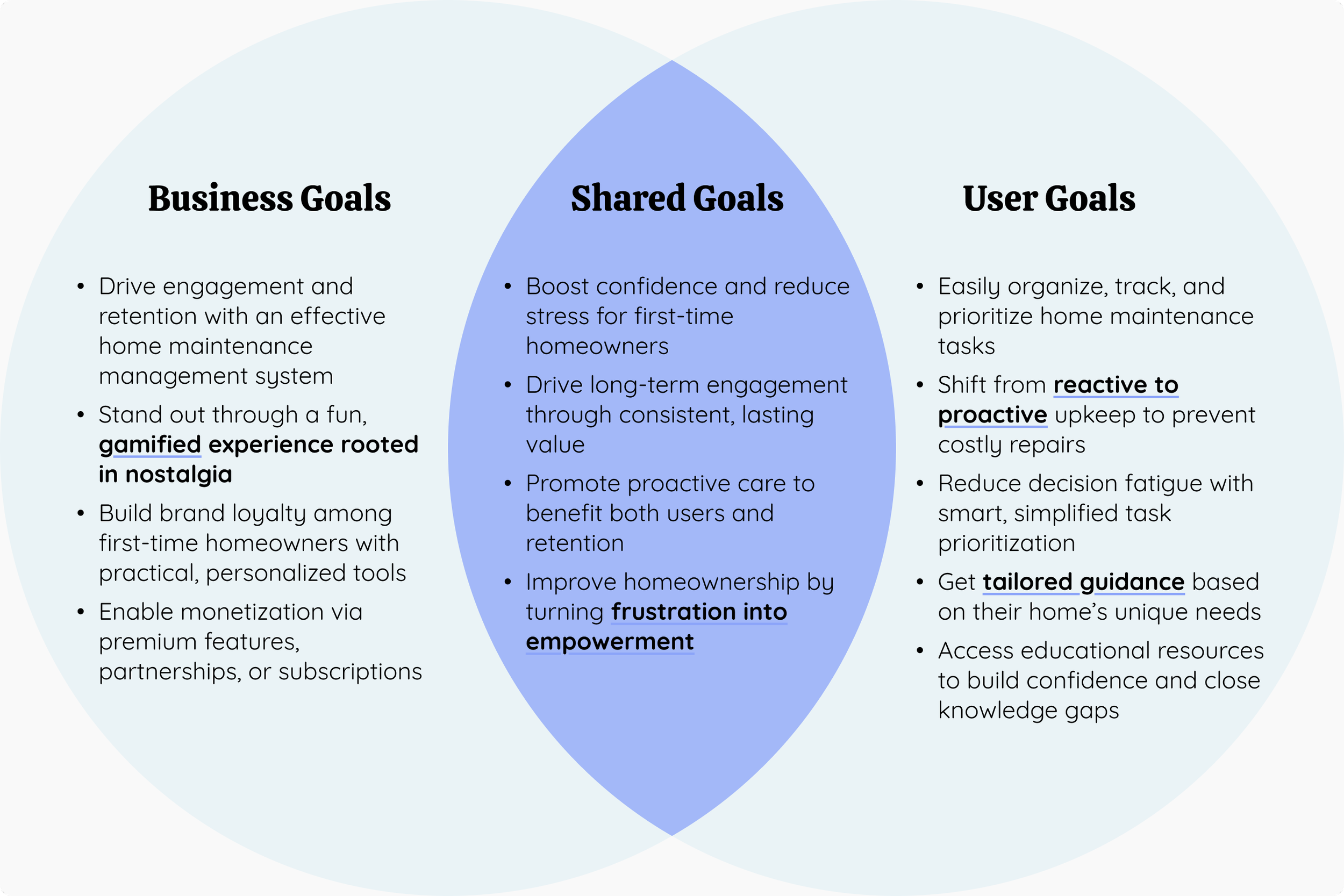
Defining Project Goals
Meet the UpKeep Persona, Dave

Dave
The DIY Dad
Dave is a young dad and technology professional who values friends, family, and the great outdoors. After years of hard work, he and his wife achieved their dream of homeownership, and he takes great pride in maintaining their investment despite the inevitable headaches that come with it. When he's not busy with work or hanging out with friends and family, he enjoys tackling home projects to keep their space safe, comfortable, and in top shape for their two small kids. Plus, Dave considers the skills he’s learning along the way an added bonus. Whether it's upgrading features, handling essential repairs, or simply enjoying the backyard, he’s always willing to put in some effort to enhance the life he and his wife have built together.
“Every time I look at that shed now, I'm like, ‘I did that. I built that.’ And that feels good.”
Needs & Goals
System for organizing and prioritizing of home maintenance projects
Protect the value of his family’s home while maintaining safety and comfort indoors and out for as long as possible
Learn new skills and build confidence in home repairs and maintenance
Frustrations & Pain Points
Unexpected repairs taking priority over planned tasks
Figuring out which home maintenance tasks need to be done first when there are so many to complete
Finding an unbiased source to help make decisions about prioritizing home maintenance tasks
Weighing the pros and cons of DIY versus hiring professionals in terms of cost, skill, time, and effort considerations
Online resources are incredibly helpful, but often need to be taken with a grain of salt since every home and issue is unique
The Problem
Crafting a focused problem statement helped ensure I was solving the right problem for the right user (AKA Dave) in the right way.
First-time homeowners take pride in learning how to care for their homes, but the sheer volume of routine maintenance tasks can quickly become overwhelming. Without a clear system to organize, prioritize, and receive tailored guidance, decision fatigue sets in, making it difficult to stay proactive, avoid costly mistakes, and feel confident in their abilities.
Ideate
Brainstorms, Sketches, and Strategizing
With a core problem to focus on I could start figuring out what my app design was actually needed to do in order to help solve it. I explored ways to turn routine tasks into something more rewarding, sketching out ideas that balanced utility with personality.
PROCESS AT A GLANCE
Feature Set
Site Map
User & Task Flows
Low-fidelity wireframes
Low-fidelity user survey
Given that I was designing an MVP, I needed to prioritize features carefully so using insights from the research, the defined problem statements, and clear project goals, I categorized features into Must-Have, Nice-to-Have, and Can Come Later.
Feature Set
-
To deliver more relevant and actionable guidance, users create a personalized home profile when they first join.
Research showed that first-time homeowners often rely on generic advice that doesn’t account for their home’s unique features. This setup ensures tailored task recommendations from the start.
-
Using the home profile as a foundation, the app generates a pre-populated list of recommended tasks complete with frequency, difficulty, time estimates, and tips.
Research revealed that while first-time homeowners generally know what needs to be done, they struggle to organize and prioritize tasks efficiently. A structured, bird’s-eye view helps reduce decision fatigue, fill in knowledge gaps, and turn a stressful to-do list into a manageable action plan.
-
Lets users filter tasks by frequency, difficulty, duration, etc. so they can match their to-do list to their time or energy.
Research showed that homeowners often squeeze in maintenance when they can, but feel overwhelmed when deciding where to start. -
Lets users add custom tasks to their maintenance list because everyone has that one thing only their house has.
Research showed that generic advice often falls short, so giving users full control ensures their task list reflects their actual needs, not just the average home. 💡Like side quests?
Must Have:
-
Helps users stay on track with smart, personalized reminders whether it's time to clean the air filters or prep for an incoming storm.
While users generally know what needs to be done, research showed they’re often unclear on when or how often leading to missed tasks and mounting stress. -
A bird’s-eye view of the year so users can anticipate what’s coming and plan ahead. Instead of getting caught off guard, homeowners can see seasonal trends and task patterns at a glance.
-
Bite-sized, interactive learning opportunities that pop up throughout the app to help users build skills and confidence over time.
Research showed that users don’t know what they don’t know. These moments turn every task into a chance to level up, not just maintain. -
A built-in AI helper that offers personalized support whether it’s helping users prioritize tasks, troubleshoot issues, or just figure out what to do next.
With decision fatigue and a steep learning curve making maintenance feel overwhelming, having smart guidance makes it easier for users to stay on top of it all. 💡What if it’s a dragon or wizard?
Nice to Have:
-
Expert-backed videos, tips, and how-tos right inside the app. No more hopping over to YouTube or WikiHow every time something breaks.
Since users take pride in learning new home maintenance skills, the app delivers clear, trustworthy content that builds confidence. -
Allows users to upload and save receipts, warranties, repair records, etc.
Users shared that it’s hard to keep track of what’s been done, especially when juggling DIY projects and outside contractors. -
Seamless connections with smart home devices to automate reminders and monitor home systems in real time.
Although motivated, users often struggle to stay proactive. This integration helps keep maintenance on track effortlessly.
Can Come Later:
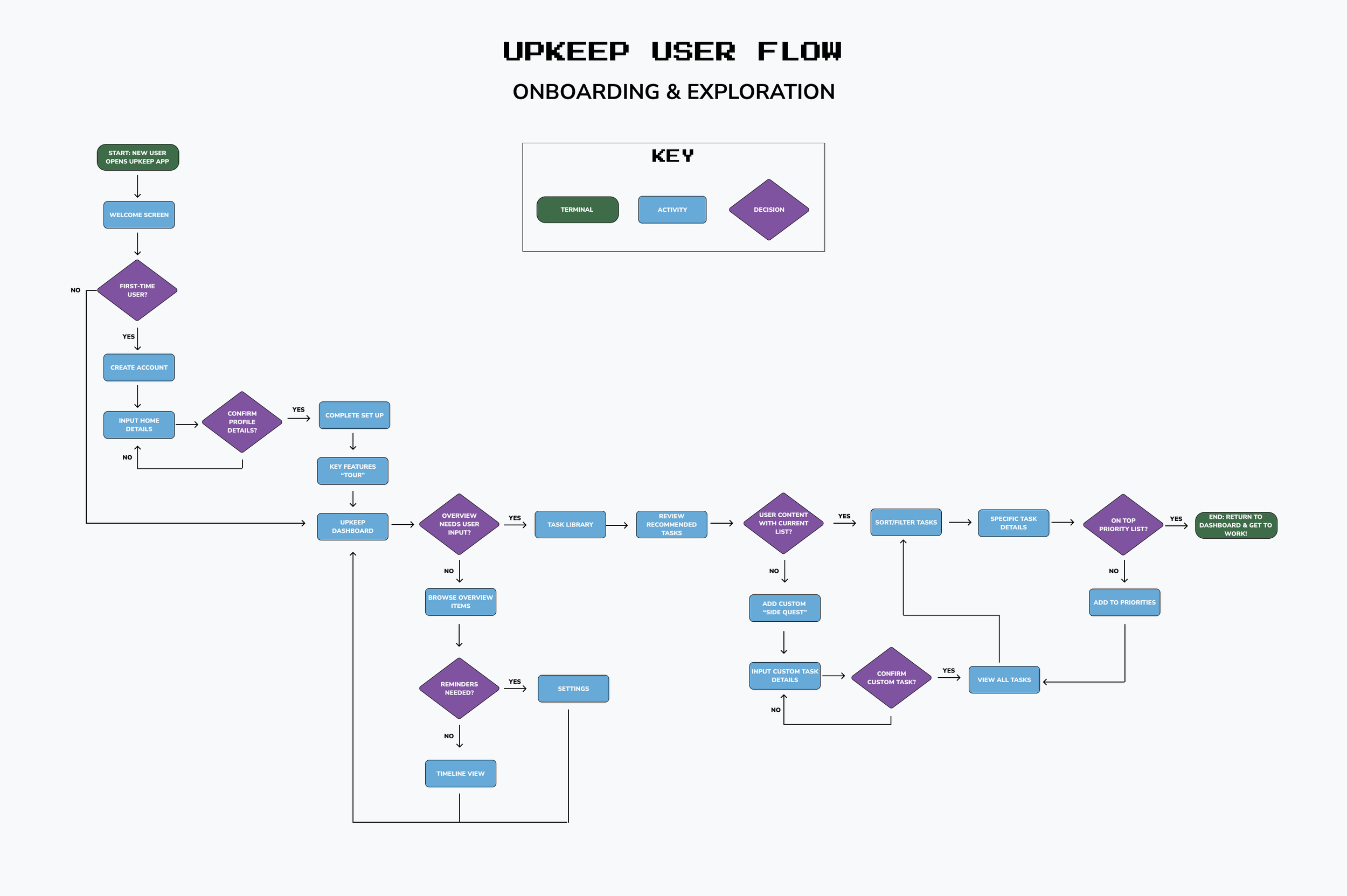
To help me understand how all of my planned features would fit together and organize navigation in a way that supports users’ goals and keeps the experience straightforward I outlined the overall structure through a sitemap.
Creating a Sitemap
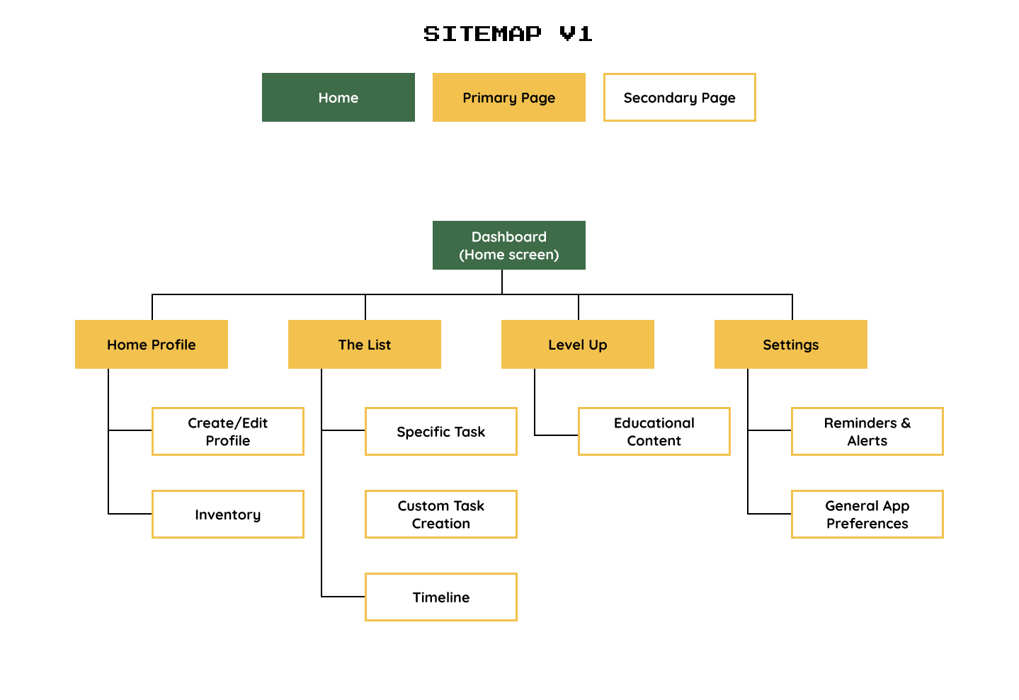
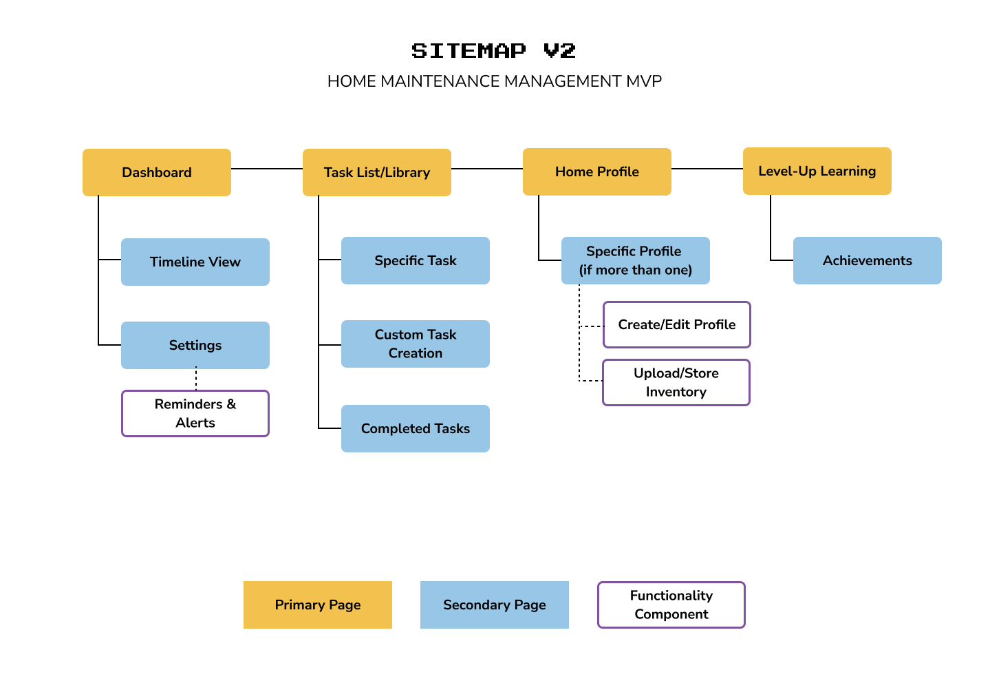
I worked through multiple versions to nail down the best way to organize all of the features I wanted to include and still make navigation and page hierarchy feel intuitive. The final version was revised after my user flow revealed a few gaps that needed to be filled.
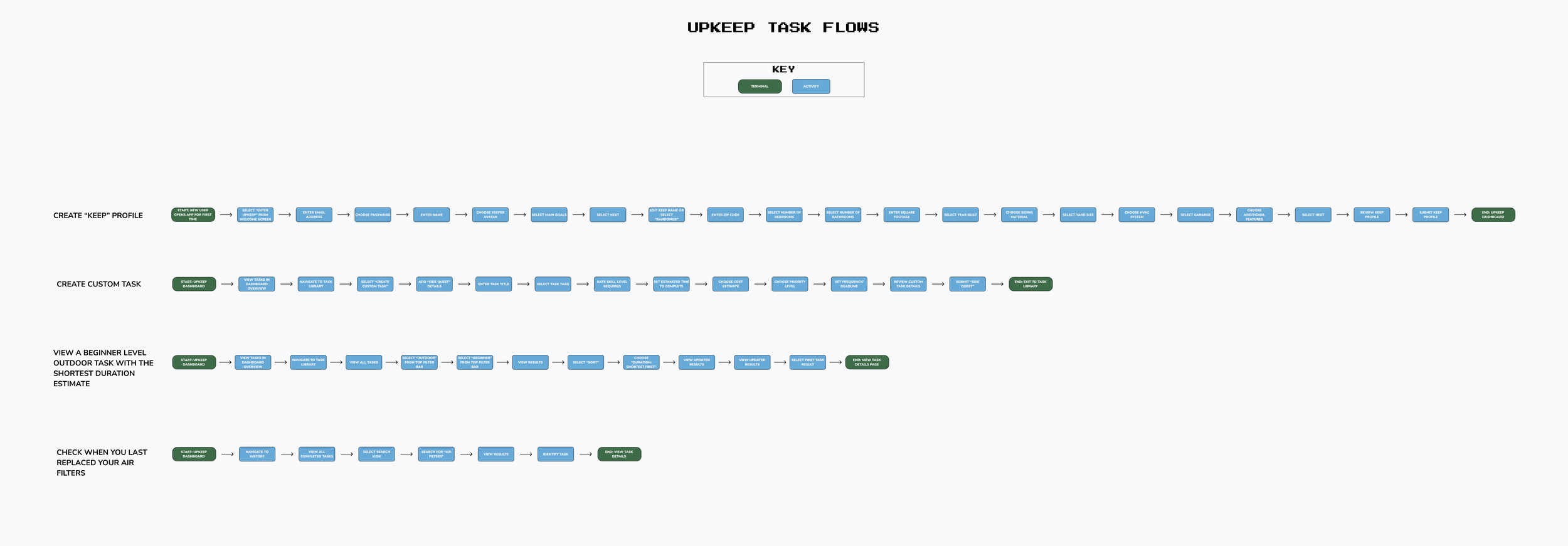
Once the sitemap was in place, I moved on to user and task flows to see how my users would actually move through the app and get things done. Then I zoomed in even further with task flows to make sure each step was simple, clear, and just plain doable.
What Would Dave Do?
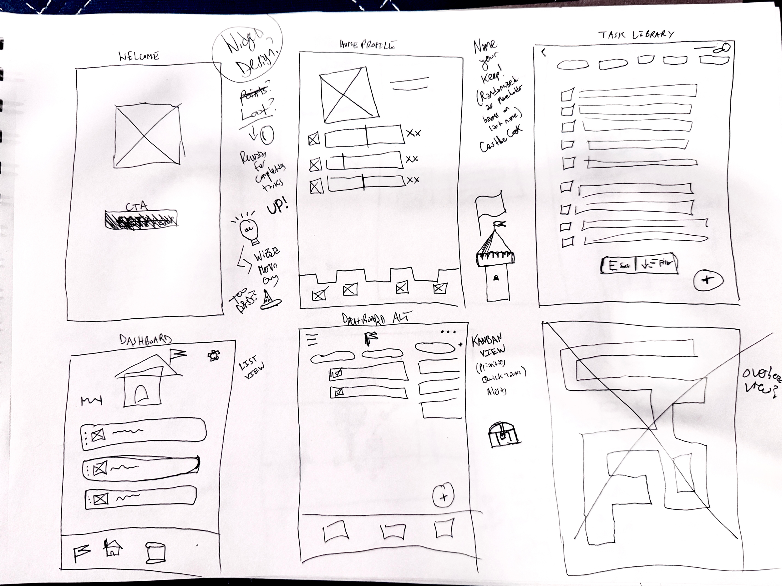
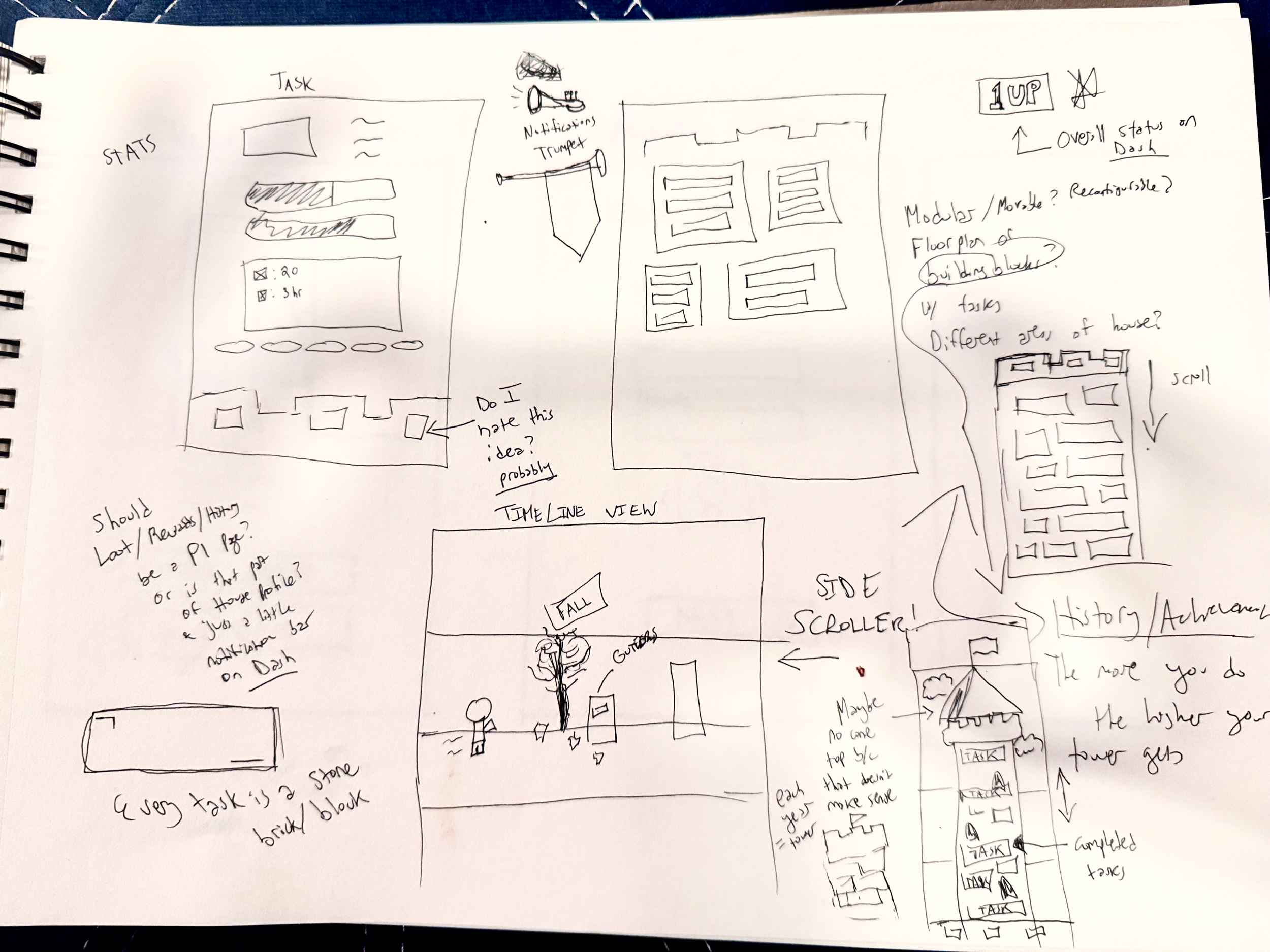
Low-Fidelity Wireframes
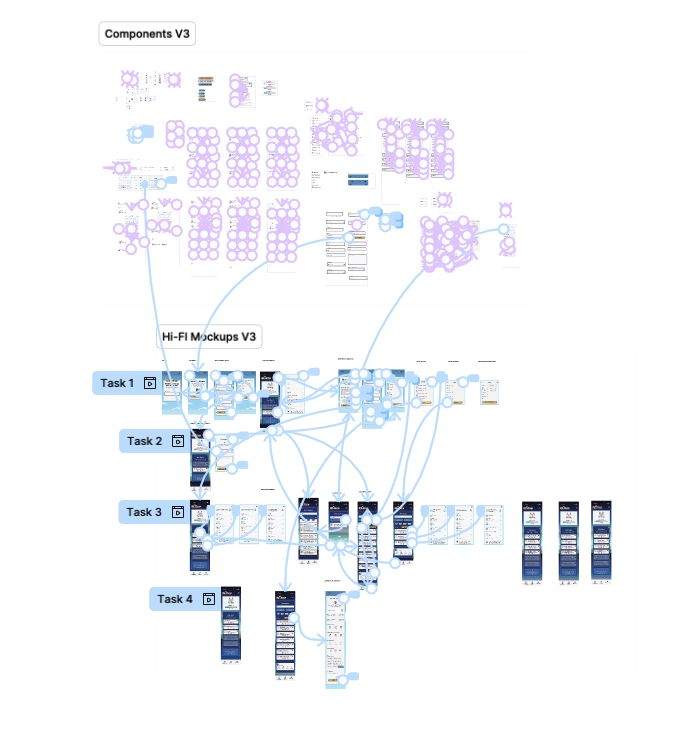
This early strategic work helped me bring the concept to life through low-fidelity wireframes, which I then put in front of users for feedback. Even at this rough stage, testing helped surface what was working and where the experience needed more clarity or delight.
-
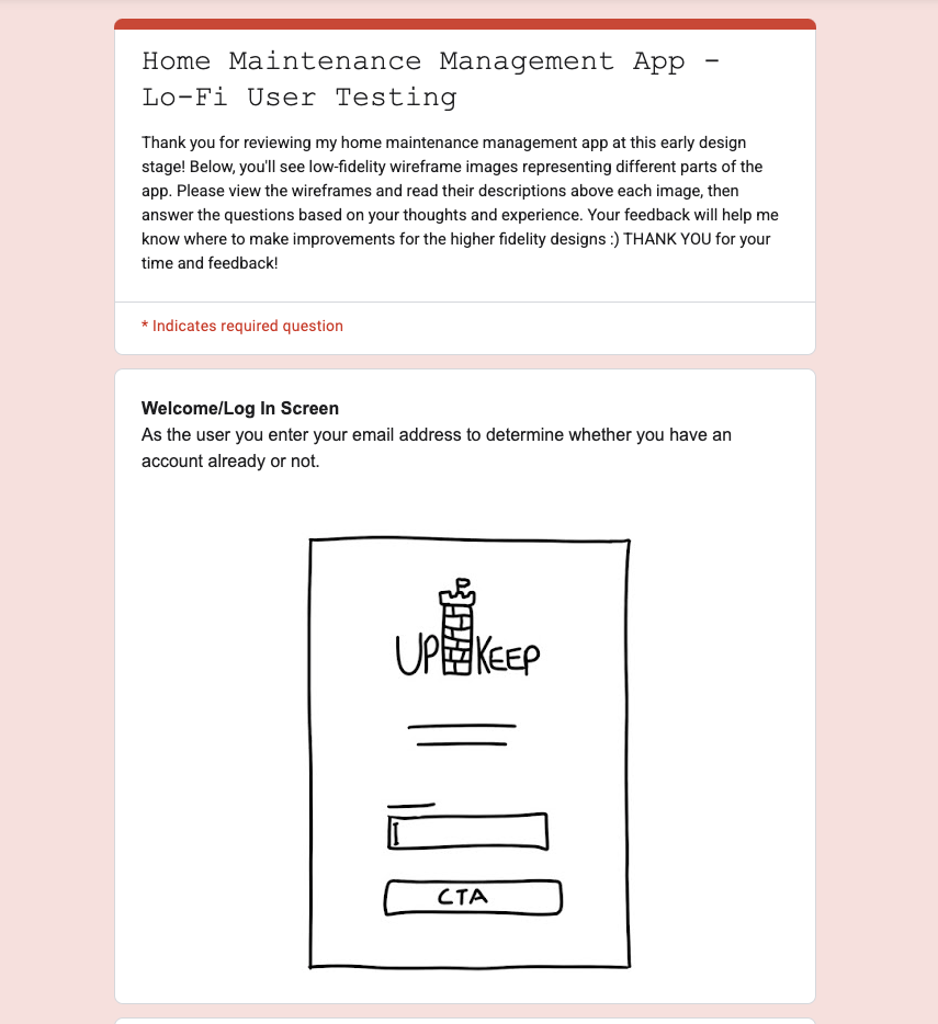
![]()
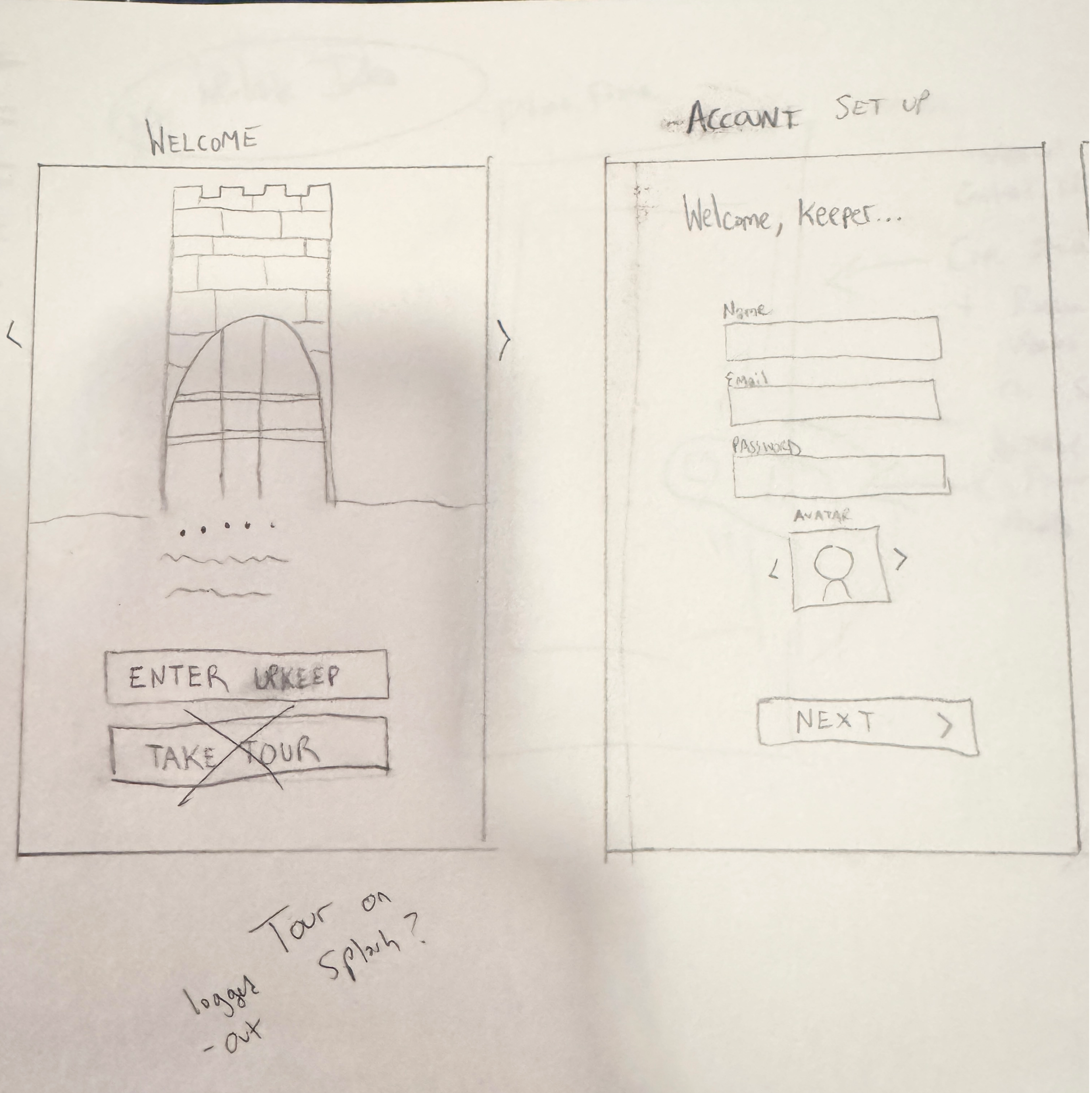
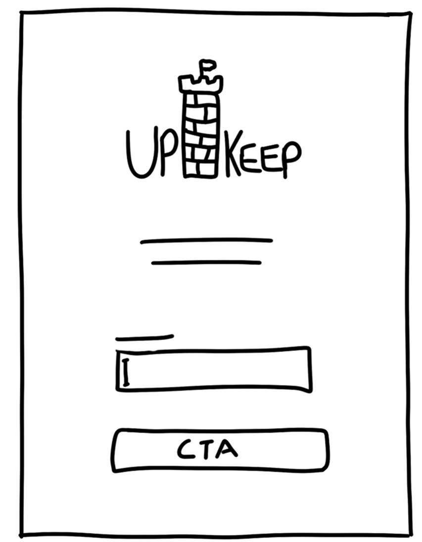
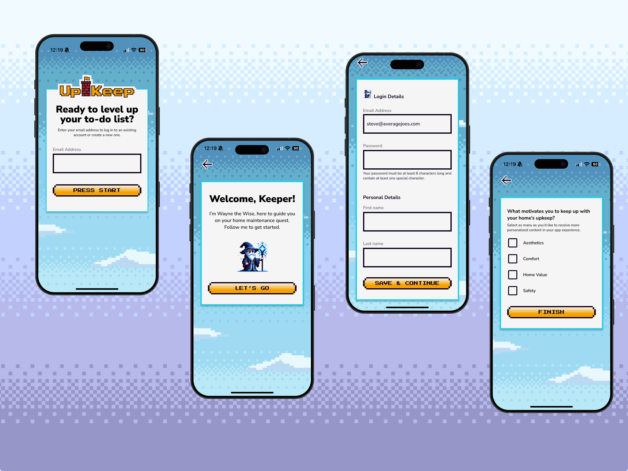
Welcome/Log In
User enters email address to determine whether they have an account already or not.
-
![]()
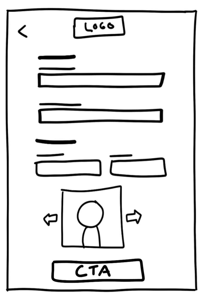
New Account Setup
Because they don’t have an account they are taken straight to a new user account creation page. User’s email address will be auto populated from previous page and they will choose a password then enter other personal details before choosing a “Keeper” avatar.
-
![]()
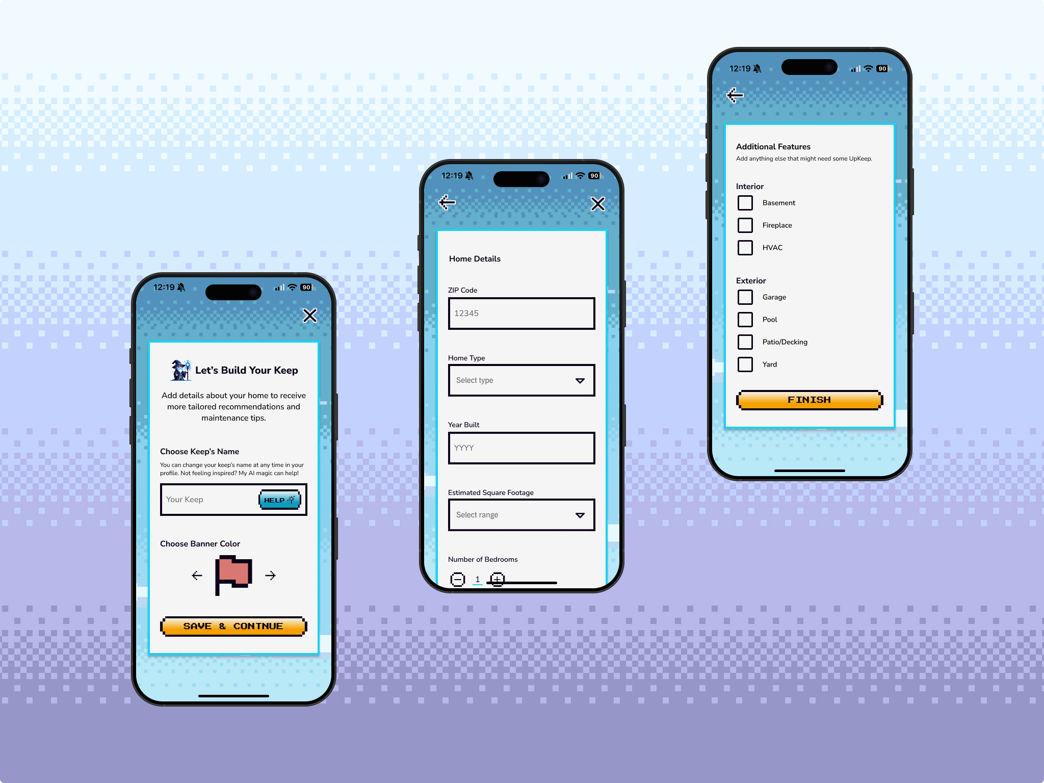
"Keep" Profile Creation
After confirming their account details, the user is prompted to create their Home Profile by answering questions and adding information about their house, including naming their “Keep.”
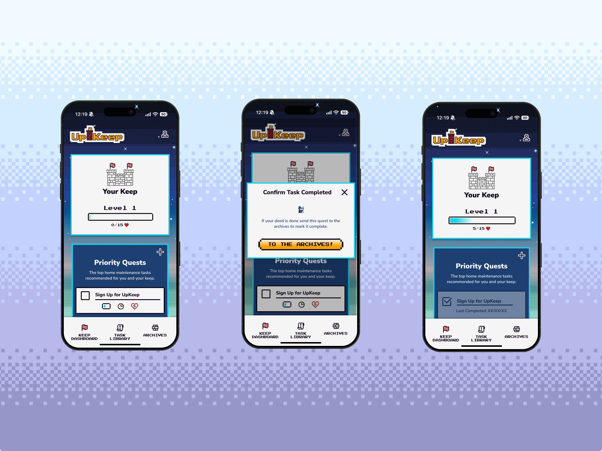
-
![]()
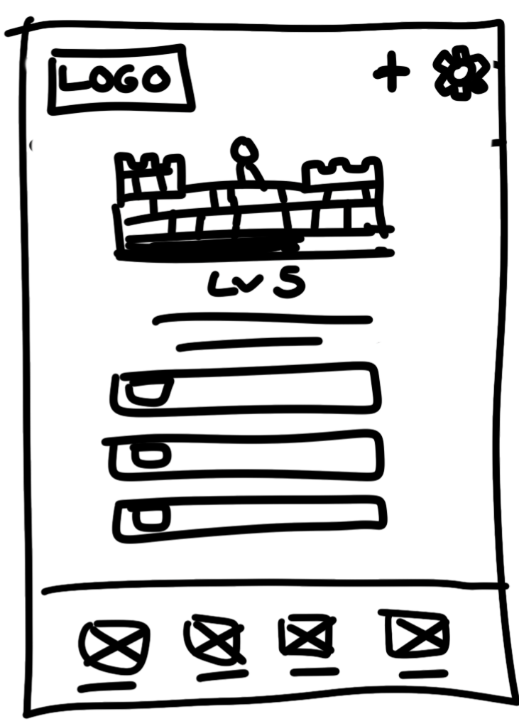
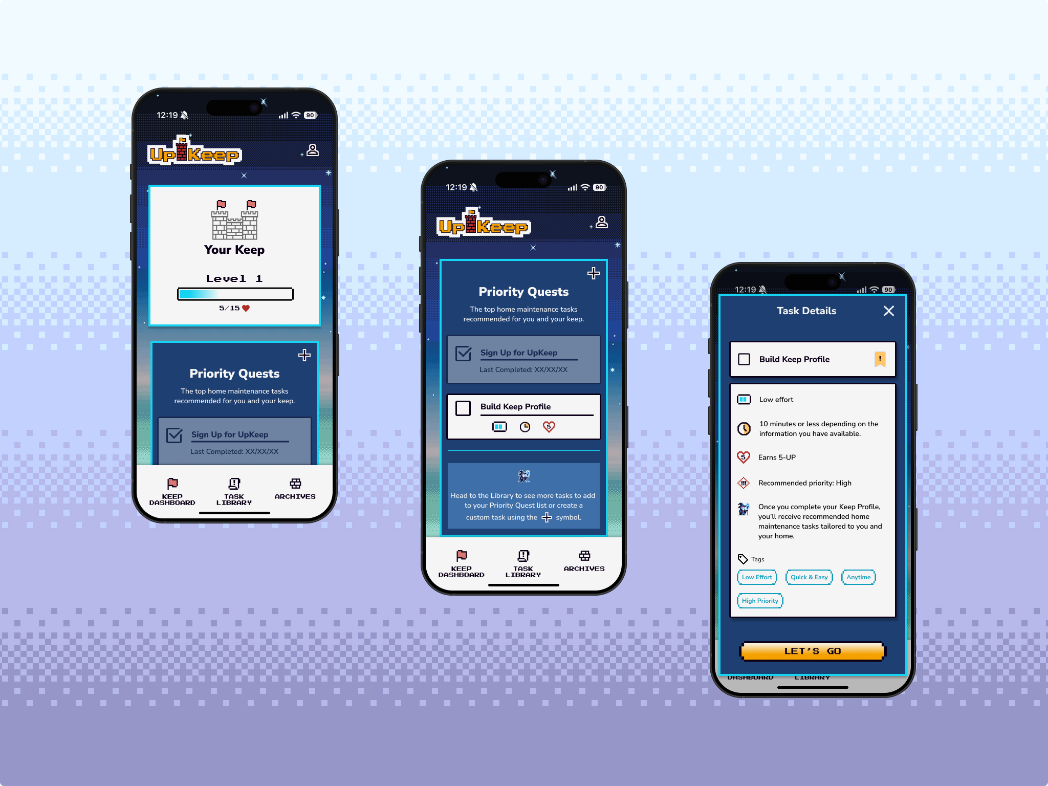
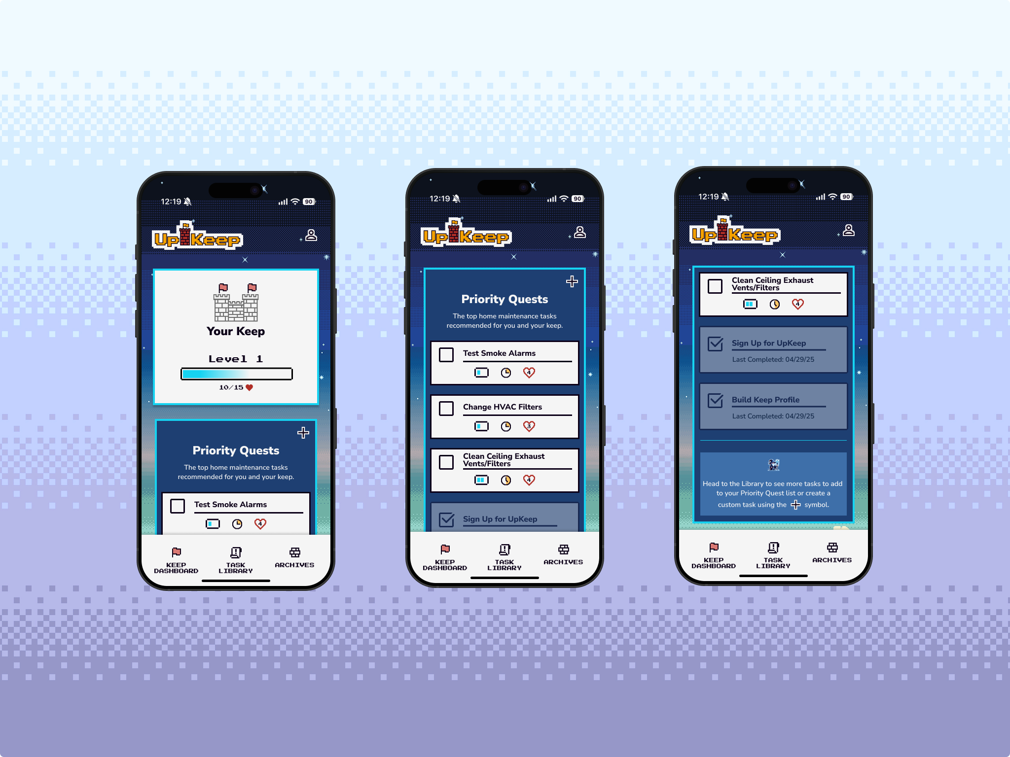
UpKeep Dashboard (Primary)
On the main UpKeep Dashboard users are shown a representation of their keep and their current level, which can be increased by completing tasks. The tasks shown on the dashboard are the top priority tasks.
-
![]()
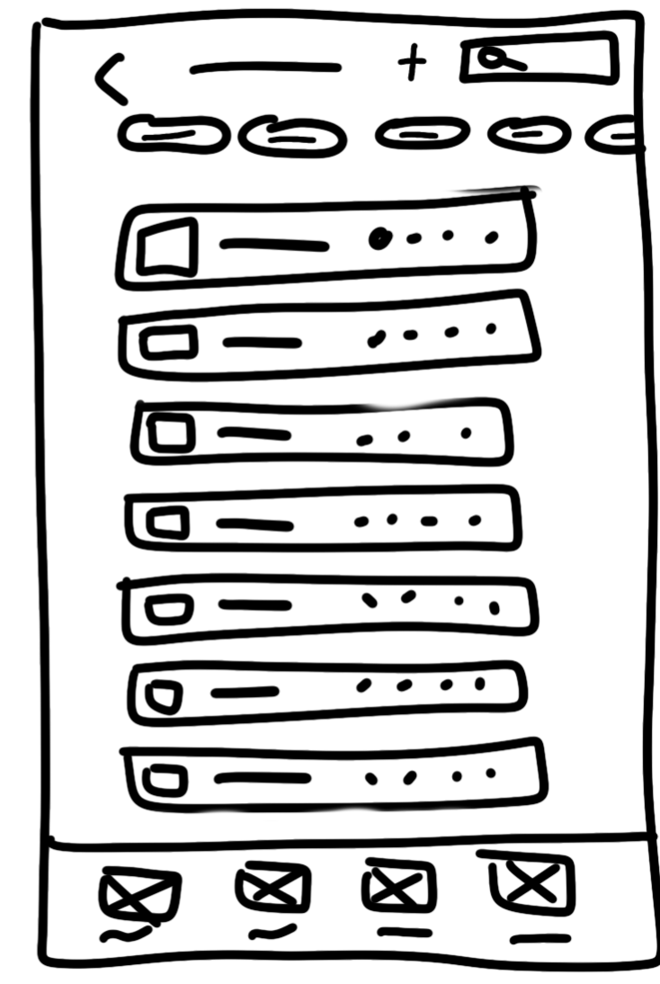
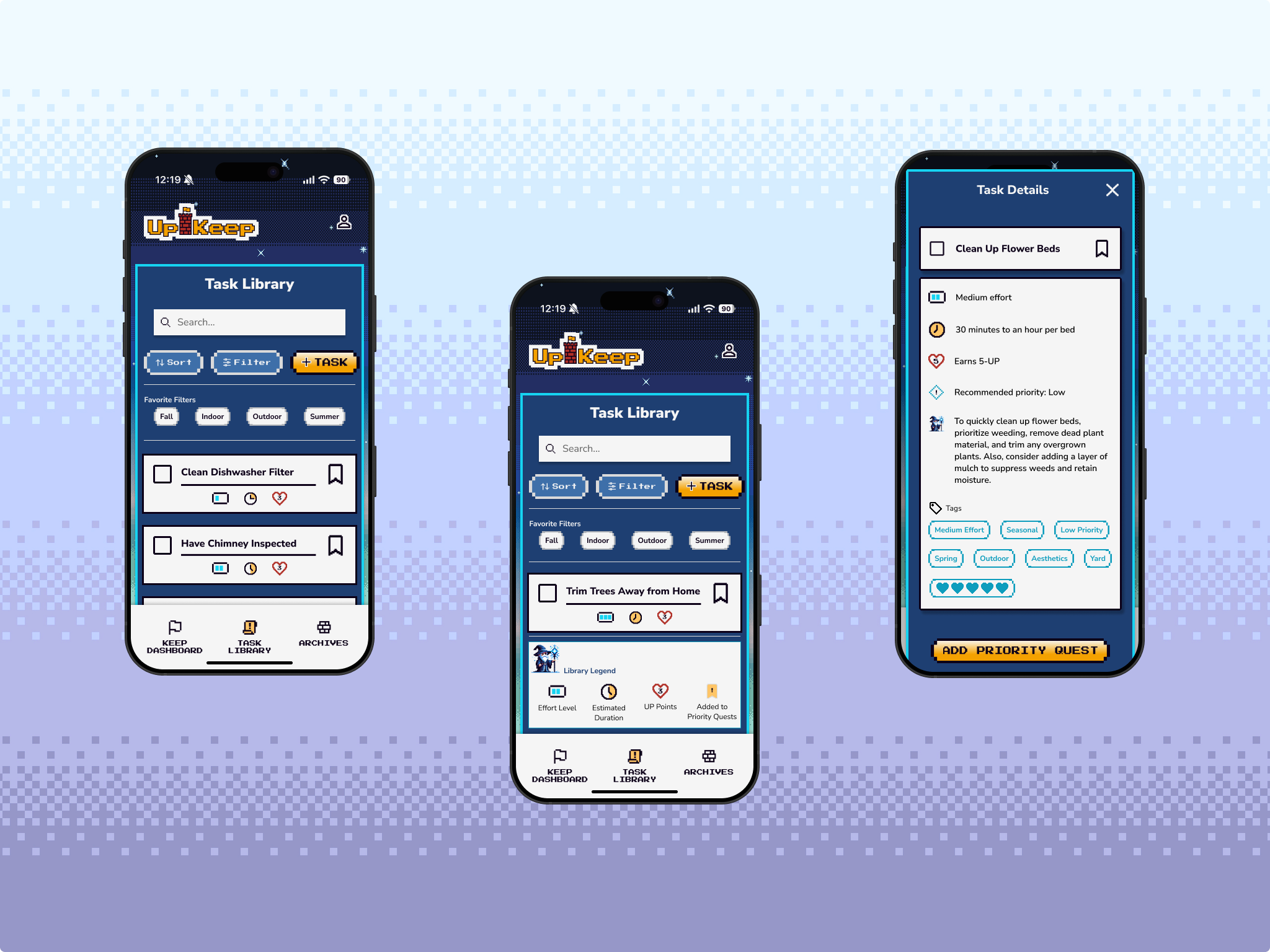
Task Library (Primary)
In the main task library users can sort and filter their recommended tasks by a variety of categories to better organize and prioritize their home maintenance plans. They can also search, add custom tasks, and view more details about specific tasks.
-
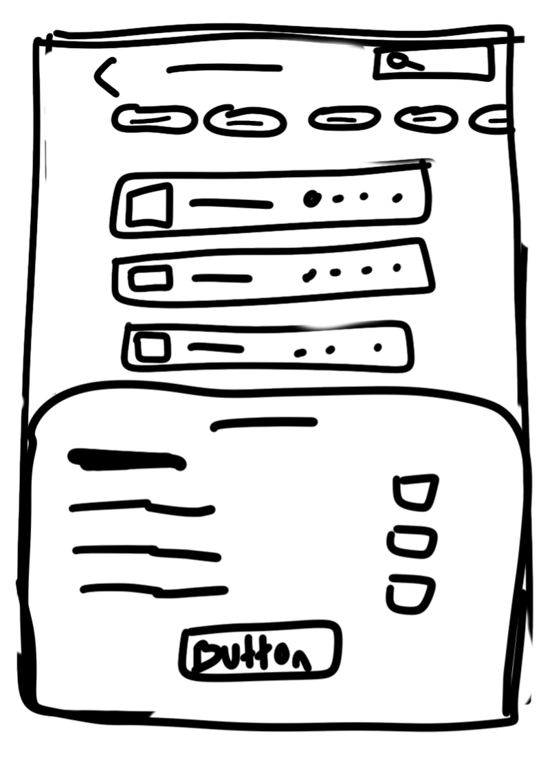
![]()
"Sort By" Bottom Sheet
Allows users to quickly and easily prioritize tasks.
-
![]()
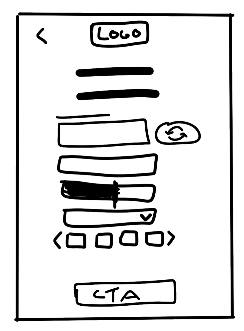
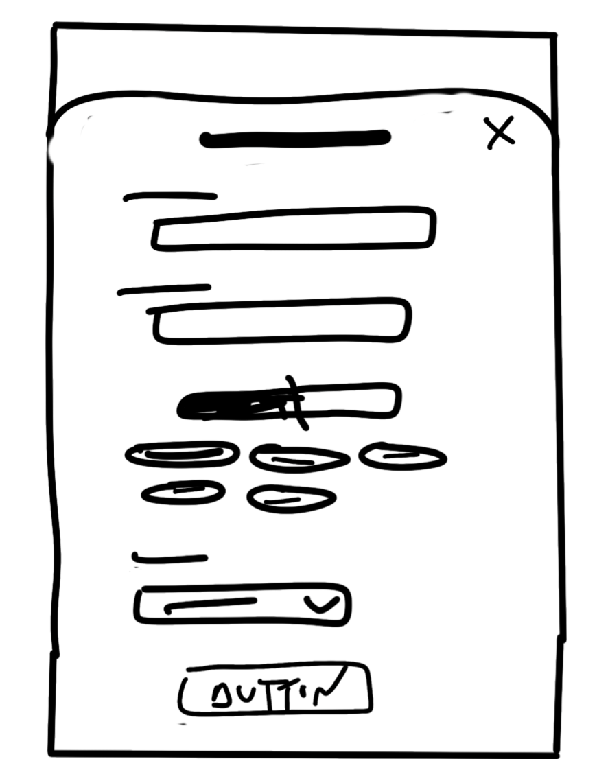
Custom Task Creation
To create a task and add it to the library users just need to give it a title, add details about the skill level, time, and resources required, and tag it with the proper tags.
-
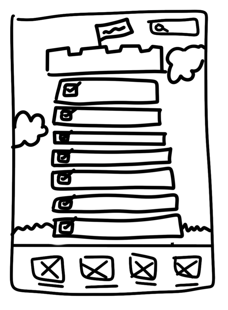
![]()
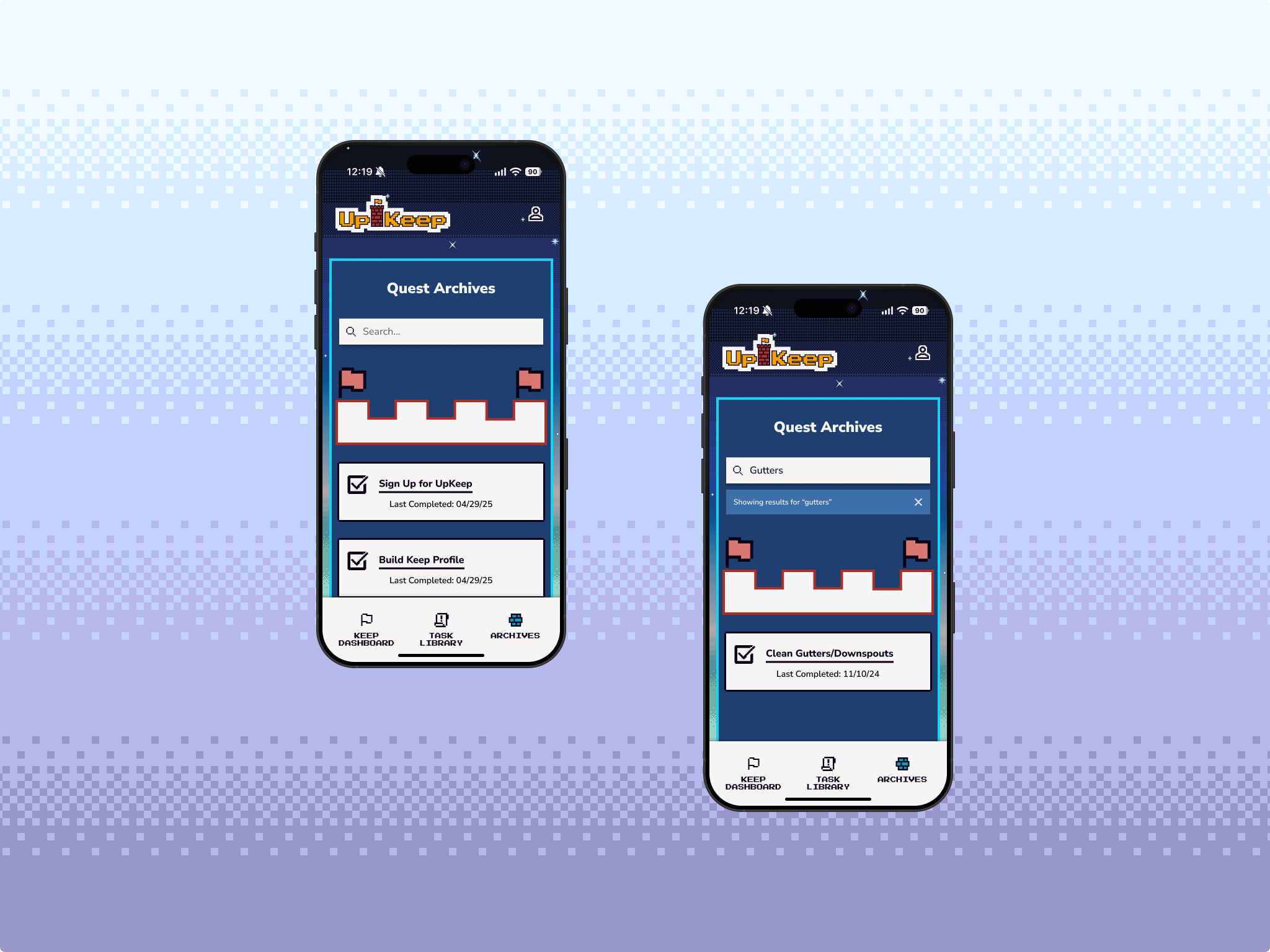
History (Primary)
Users can view all of their past hard work and accomplishments in the form of a towering list of completed tasks. The tower grows with each new checked-off task and has a search feature so users can refer back if needed.
Ideate
Validating Ideas Through Testing
Using my low-fidelity wireframes I tested the overall flow, navigation, and general user understanding of my Ollie’s responsive web design as well as its level of “community connection” with users. The feedback received helped me improve my designs before I moved into higher fidelity.
Methodology:
Unmoderated user survey with follow-up conversation for clarification purposes
5 participants from user pool
Screenshot of my Google Forms user survey
What Worked:
Personalization landed: Users understood how the avatar and home banner gave them a sense of ownership and personality.
Main Dashboard made sense: All participants quickly grasped the app’s overall purpose from this screen.
Gamification clicked: The level progress bar was seen as motivating and fun.
Navigation felt intuitive: Everyone identified the four key areas of the app with no issues.
“I like seeing this visual representation of success, but will I also see the last time I changed my air filter?”
Mixed Feedback:
Accordion vs. dedicated task details: While some liked the compact accordion, most preferred the full page for clarity and decision-making support.
Sort By experience: The feature was useful in theory but not in practice — its location and behavior felt unexpected or distracting.
Search vs. Sort: Search was the go-to; Sort was nice to have it just needed a better home.
Progress Page = dual purpose: Users loved the tower visual, but also expected more data and access to their task history.
Preference for Seeking Tasks
Task Details Style Preference
What I Adjusted:
Chose Dedicated Task Detail Page as the default.
Started brainstorming more meaningful personalization touchpoints.
Reworked the Sort/Filter menu for better placement and clarity.
Committed to making the History/Progress page more functional, not just visual.
Design
Building UpKeep
Bit by Bit
So what’s the deal with the 8-bit castle theme? Designing UpKeep wasn’t just about structure or features, it was also about storytelling. I leaned into my background in advertising and marketing—specifically my experience building brands that feel both strategic and emotionally resonant—in order to make home maintenance feel less like a dreaded chore and more like a fun, achievable quest.
That’s where the 8-bit graphic style and castle theme came in. Inspired by nostalgic tech like Tamagotchis and early video games, this design direction is playful and familiar. And for my target users, (primarily millennials and older Gen Z-ers stepping into homeownership), it taps into childhood memories while reimagining home maintenance as a lighthearted, gamified experience.
My initial inspired mood board.
PROCESS AT A GLANCE
Brand Development
Logo Development
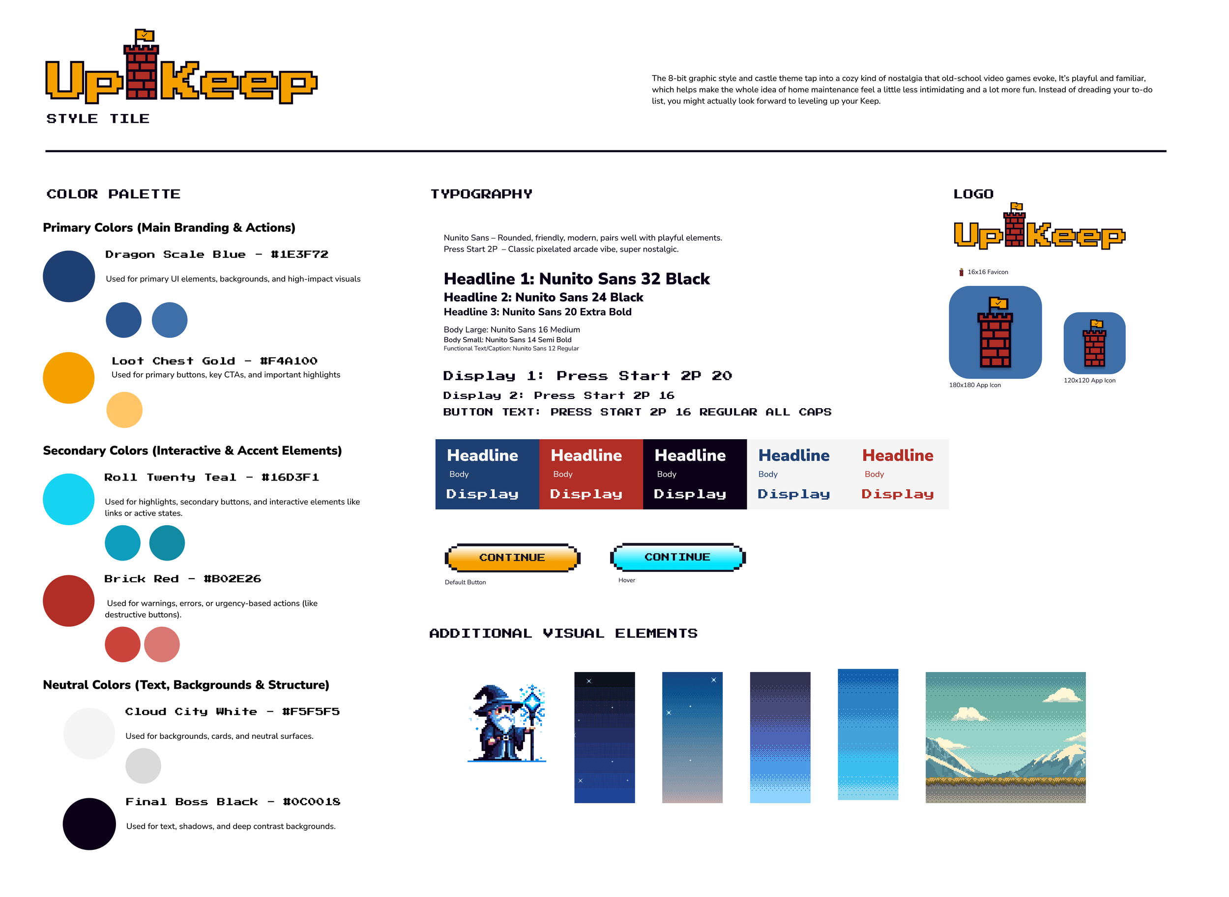
Visual Style Tile
High-Fidelity Mockups
What’s in a Name?
“UpKeep” felt like the perfect fit from the start. Honestly, it was a bit of a chicken-or-egg situation — did the name inspire the castle theme, or did the castle theme lead to the name? Who’s to say. What matters is that it’s short, clear, and rooted in the everyday reality of homeownership, while also hinting at something a little more optimistic..
Brand Values
These values guided everything from tone of voice and color choice to priority revisions:
Empowerment
Help users feel capable and in control by turning overwhelm into something manageable and rewarding.
Playfulness
Home maintenance is a chore, but that doesn’t mean it has to feel like one.
Simplicity
Life’s complicated. UpKeep isn’t.
Confidence
Build trust in the app and in the user’s own abilities.
Logo Creation
With the name and brand values in place, I wanted the logo to reflect both utility and personality. I explored a few visual directions, but ultimately landed on a design that’s simple, playful, and just a little bit nerdy (in the best way).
The final logo includes:
A subtle nod to pixel art hinting at the aesthetic behind UpKeep’s 8-bit design system and bringing in some nostalgia and fun
A checkmark waving proudly on the tower’s flag, reinforcing the sense of accomplishment and task completion that UpKeep supports.
Typography with personality that reinforces the gamification aspects of the app


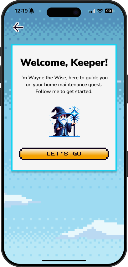
Wait, is that a wizard?
That’s not just any wizard—that’s Wayne the Wise. He’s the in-app guide, here to help you learn the UpKeep ropes.
Wayne’s vibe? A little cheeky, super supportive, and refreshingly unpretentious. I named him “Wayne” for a reason.
Brining Wayne to life let me combine my love of character writing with thoughtful UX. He’s part helper, part hype squad, and totally scalable if UpKeep extends its AI capabilities.
UI Components
Once I had the logo wrapped up, the brand aesthetic clearly defined in my style tile, and the wizard named, I could move on to building out the full UI kit, laying the groundwork for a cohesive, functional, and delightfully retro interface. All the while thinking….what would Dave find useful, usable, and enjoyable?
High-Fidelity Mockups
With the brand dialed in, the UI elements ready to go, and my ideas validated my research, it was finally time to bring the whole thing to life. Like assembling all the members of a questing party (IYKYK), I now had everything I needed to level up from components and pixels to full high-fidelity mockups where the real magic (and Wayne!) starts to shine through.
Test &
Iterate
Press Start
Would people like Dave actually want to use a fantasy-themed home maintenance app with a wizard and find it useful? That was the big question.
To find out, I put UpKeep to the test using my high-fidelity prototype. I observed five participants (three remote, two in-person) as they navigated core features, reacted to the brand’s personality, and uncovered moments of delight or friction.
Spoiler: Wayne the Wizard made quite an impression.
What I tested:
Creating an Upkeep Account
Building a “Keep” (Home) Profile
Checking When a Specific Home Maintenance Task Was Last Completed
Adding a Recommended Task to the Priority Quests List
What I measured:
Task completion rate – Were users able to complete tasks without help?
Time on task – How long did it take to complete each task?
Error rate – Where did users stumble or misunderstand the flow?
Self-reported ease of use – How easy did tasks feel on a scale of 1–5?
Self-reported confidence in navigating the app (on a scale of 1-5)
Self-reported motivation to complete task (on a scale of 1-5)
Accuracy of specified task identification
User feedback on visibility and organization
Usability Testing Results
Wins
Wayne the Wizard stole the show - All participants called out the character’s personality as a delightful addition to the experience, but more importantly considered him a helpful, reliable guide.
Strong balance between fun and functionality - The aesthetic was not only noticed but several users said the visuals made them feel more excited to take action.
Gamification felt just right - Elements were highly motivating, especially UP-points, retro game styling, and task sorting by effort, time, and priority
Overall, testers said the app made them feel more motivated to stay on top of home maintenance tasks. VICTORY!
Opportunities
Task Library vs. Archives confusion - Several users weren’t sure where to find saved tasks or how to view completed ones. The language felt too similar.
Not enough feedback - Users wanted more satisfying moments, like animations or sounds, when they completed a task or leveled up. The growing tower visual wasn’t overall considered motivating
Limited customization - A few participants asked if they could further edit task priorities, add notes on completed tasks, include additional home features and have ”other” inputs.
Surprises
Several users instinctively used the Profile icon instead of the Main Quest List to view their top priorities.
Only two testers interacted with the Task Bricks. Most bypassed these mysterious stones altogether.
Many users expected the “+Task” button and checkbox to work in unison, assuming that would send tasks straight to the Main Dashboard.
Priority Revisions
Testing confirmed users found UpKeep fun, easy to use, and visually engaging. The retro 8-bit aesthetic and Wayne the Wise were standouts, motivating users and helping them feel supported throughout their journey. Most importantly, all testers said they would use the app in real life (phew!).
To build on this momentum and smooth out key friction points, I prioritized updates that balance high impact with low effort focusing on clarifying confusing areas, improving task customization, and strengthening interaction flows.
Main Dashboard
What Changed:
To improve navigation and clarify feature functionality, I renamed “Task Library” to “Side Quests”, a more thematic and intuitive label that better distinguishes it from the Main Quests, which was adjusted from Priority Quests to further differentiate the two.
Supporting microcopy was also updated throughout the app to reinforce this change and guide users more clearly.
Completed Task Confirmation
What Changed:
To address user requests for both note-taking and calendar features, I combined the two into a single, streamlined solution. The Task Complete Confirmation overlay was updated to include:
A “date completed” input field
An optional notes section
This allows users to quickly log helpful context before the task is archived making the feature more interactive and personally useful without adding friction.
Recommended Tasks List (Side Quests)
What Changed:
To help users quickly gather information and better understand the Legend, I added a hyperlink near the top of the Side Quests page that anchors directly to the visual guide at the bottom.
Since some users also struggled to locate the Add Custom Task button, I used this opportunity to adjust its placement and styling to make it more visible and intuitive.
Recommended Tasks List (Side Quests)
What Changed:
What started as a Low Effort/High Impact change quickly evolved into a High Effort/High Impact redesign. After introducing note and date inputs in the task completion overlay, I expanded the task details functionality to give users more control and customization options.
This added flexibility better aligns with user needs and persona goals but because it introduces entirely new interactions, it will require dedicated usability testing.
Final Prototype
Quest Complete
Designing UpKeep from scratch was equal parts fun and challenging. Balancing UX, UI, and content sharpened my attention to detail, strengthened my systems thinking, and highlighted how user testing can level up a design.
Gamifying the experience was especially rewarding. Leaning into playful visuals, a mascot, and progress-based motivation helped transform home maintenance into something more engaging and empowering.
There’s still plenty I’d love to build next from expanded avatars and multi-user households, to smarter reminders and even potential service partnerships.
But I’m proud that UpKeep doesn’t just work, it sparks joy. It’s a purpose-built, user-centric product designed to turn an overwhelming to-do list into a magical challenge.